
41 Free, Open Source and Top Chart Builder Software

Data visualization involves the creation and study of the visual representation of data, the information that has been abstracted in some schematic form, including attributes or variables for the units of information. The primary goal of data visualization is to communicate information clearly and efficiently to users via the information graphics selected, such as tables and charts.
The effective visualization helps users in analyzing and reasoning about data and evidence and makes complex data more accessible, understandable and usable.
Data visualization is both an art and a science. The rate at which data is generated has increased, driven by an increasingly information-based economy. The structured and unstructured data created by internet activity and an expanding number of sensors in the environment, such as satellites and traffic cameras, companies, organisations, government are referred to as "Big Data". Processing, analyzing and communicating this data present a variety of ethical and analytical challenges for data visualization.
You may like to review the Best Practices in Data Visualization
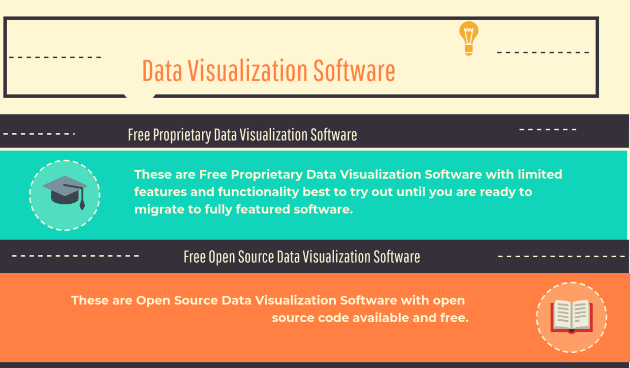
What are the Best Free Proprietary Data Visualization Software: Tableau Public, Google Charts, Kibana, Google Fusion Tables, DataWrangler, Google Public Data Explorer, Instantatlas, Arcadia Data Instant, Visualize Free are some of the Top Free Proprietary Data Visualization Software.
What are the Best Free Open Source Chart Builder Software: RAWGraphs, Amira, Avizo, D3.js, Plotly, Chartist.js, Datawrapper, Leaflet, Gapminder, Weave, ParaView, NodeBox, JpGraph, dygraphs, MayaVi, ggplot2, IBM OpenDX, Envision.js, Polymaps, Voreen, Vaa3D, Prefuse, VTK, SIMILE Exhibit, Circos, Tomviz, VisIt, PathVisio, Ggobi, Charted, Flare are some of the Top Free Open Source Chart Builder Software.
What are Data Visualization Software?
Data Visualization Software is an analytics technology that helps business users to convert data and other metrics from text or numeric format into a graphical or pictorial format that is easy to consume and interpret. Data Visualization Software can draw data from different sources and applications. It includes a wide range of visual presentation from static, to dynamic and interactive. The traditional visual format involved a variety of static visual presentation such as the graphs, tables, reports, Microsoft Excel spreadsheets, and charts.
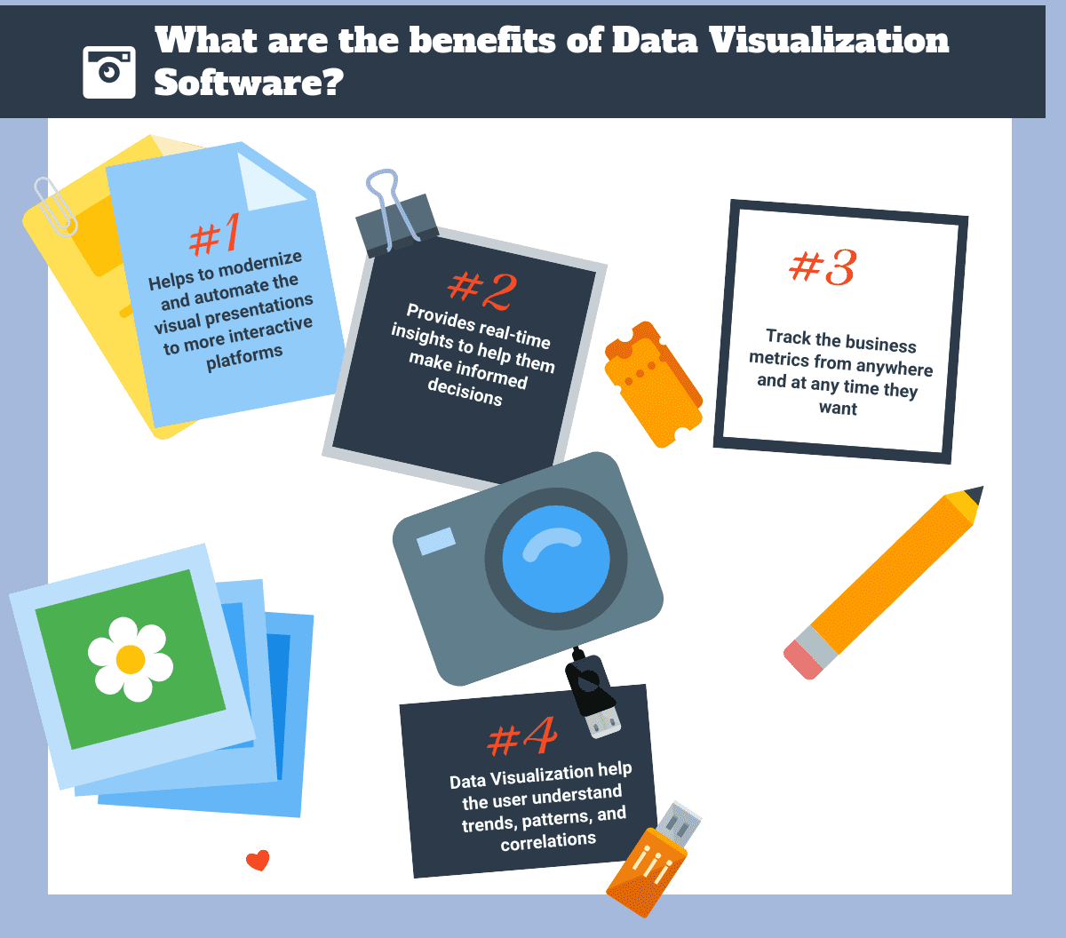
Data Visualization help to modernize and automate the visual presentations to more interactive platforms that range from infographics, gauges, and dials, geographic maps, heat maps, to sparklines among others. Data Visualization automatically interprets the data for the user and also gives them real-time insights to help them make informed decisions.
Data Visualization gives the user the option to choose how the data will be presented but makes it more automated. Some tools have automatic capabilities to interpret the shape of the visual design and to detect any correlations between different variables in a dashboard. Data Visualization helps to determines the best and the optimal chart type to use to present the information the user wants. The software dashboard element allows the users to draw various visualizations of analysis into a central interface usually a web portal.
You may like to review: Top Data Visualization Software, and How to Select the Best Data Visualization Software for Your Business
Data Visualization Software Type
Data Visualization Software key feature is its ability to integrate with data sources and also pull from different applications. Data Visualization has intuitive and approachable analytic capabilities and helps builds reports easily. Some of these software also has in-memory processing capabilities and an ability to easily distribute insights through the mobile and web platforms. This can enable the users to track their business metrics from anywhere and at any time they want.
Data Visualization offers various solutions to managers, C-level executives, sales and marketing teams, customer service teams, human resource teams, development teams among other businesses analysts. They use the technology to create dashboards, scorecards and other useful and easy-to-interpret designs to present the company's data.
Data Visualization help the user understand trends, patterns, and correlations that would go undetected when information is in the text format. The visual images offer interactive capabilities and the users are able to manipulate them or drill data for querying and analysis. Data Visualization dashboard has automatic indicators to alert the users about any conditions or changes that occur if certain variables are altered.
Data Visualization is important in business intelligence reporting which is relevant to businesses in decision making, increasing efficiency in operations and in optimizing business internal processes among other benefits. Data Visualization Software helps generate dashboards in real-time that help the businesses to make informed decisions.
What are the benefits of Data Visualization Software?
Data Visualization Software offers a competitive advantage to the company using it since the user is able to derive value from the information hidden in the environment. An organization should look for the relevant kind of data visualization software that is suitable for the specific industry or teams within an organization. For example, a marketing team may opt for the marketing analytics solution for tracking the marketing metrics progress or the sales analytics tool for tracking the sales metrics progress.
Top Free Open Source Chart Builder Software
You may like to review the How to Select the Best Data Visualization Software for Your Business


RAWGraphs
RAW Graphs is an open-source, online data visualization platform which quickly generates beautiful data visualizations from user-inputted data with those data uploaded as a file in xlsx or CSV format, uploaded from a URL, or simply copied and pasted from a spreadsheet application. RAW Graphs has features such as works with delimiter-separated values and CORS-enabled endpoints (APIs), No server-side operations or storages are performed, charts, map the dimensions of user’s dataset with the visual variables of the selected layout. It also offers mapping and export visualizations as vector (SVG) or raster (PNG) images. RAW Graphs lets users select a chart,…
• As simple as a copy-paste.
• No worries, your data is safe.
• Conventional and unconventional layouts.
• Understand and map visually your data dimensions.
• Visual feedback, immediately.
• Semifinished vectors and data structures.
Free
• As simple as a copy-paste.
• No worries, your data is safe.
• Conventional and unconventional layouts.
Amira
Amira is one of the prominent high-performance 3D visualization and analysis software for scientific and industrial data. Amira software provides advanced image data processing, exploration, and analysis features through a user-friendly graphical interface. Amira is a state-of-the-art 3D analysis software application used to visualize, manipulate, explore and understand life sciences data from computed tomography, microscopy, MRI, and other available imaging modalities. Amira provides cutting-edge 3D imaging workflows for specialists in research areas such as molecular and cellular biology, neuroscience, and bioengineering. There are three categories of Amira software: Amira for Life Sciences, Amira for Cell Biology, and Amira for Neuroscience.…
• Material characterization
• Defect analysis
• Dimensional metrology
• Easy creation & customization of inspection workflows
• Reporting and traceability
• Automation and full in-line integration
• 3D image data import & processing
• 3D data exploration
• Image segmentation and feature extraction
• Quantification and analysis
• Automation, reporting, presentation
• Single cell tracking
• Single particle tracking
• Filament tracing and editing
• Correlative Light and Electron Microscopy (CLEM)
• Data import
• Filament tracing and editing
• DTI analysis
• Brain perfusion analysis
• Object tracking
Free
• Material characterization
• Defect analysis
• Dimensional metrology
Avizo
Avizo software is used for processing three-dimensional imaging data used in material sciences, life sciences, natural sciences, and industrial inspection applications. Avizo software is easy to setup and operate. It enhances accuracy in the processing, exploration, and analysis of image data through its easy-to-use graphical interface. Avizo software can be used for several purposes and in various fields including Material Sciences, Food Analysis, and Industrial Inspection. Avizo can be used for 3D image data import and processing, 3D data exploration, and image segmentation and feature extraction. Avizo can be used in a wide range of material science research areas and…
•Material characterization
• Defect analysis
• Dimensional metrology
• Easy creation & customization of inspection workflows
• Reporting and traceability
• Automation and full in-line integration
• 3D image data import & processing
• 3D data exploration
• Image segmentation and feature extraction
• Quantification and analysis
• Automation, reporting, presentation
Free
•Material characterization
• Defect analysis
• Dimensional metrology
D3.js
D3 Data Driven Documents is a library built to be accessed by any browser, which allows you to bind data to a Document Object Model (DOM), thus allowing you to manipulate documents from anywhere. It allows you to later transform the data by working with selections of data (arbitrary sets of nodes) and manipulating individual nodes of information. It allows for easy modification and transformation of nodes, such as styling attributes, registering event listeners, changing nodes, modifying HTML or text content, and accessing the underlying DOM. You can tie operations (update, add and remove) to nodes to enhance performance. It…
• Declarative approach to manipulate individual nodes
• Functions factory
• Utilizes web standards
• Built-in element inspector to debug
• Uses SVG, Canvas and HTML
• Data-driven approach to DOM manipulation
• Developer - $7 per month (personal account)
• Team - $9 per month (organization account with users permissions)
• Business - Hosted on GitHub – $21 per user per month (organization account)
• Business – GitHub Enterprise – $21 per user per month 10-user packs, annually sold (multiple organizations)
• Declarative approach to manipulate individual nodes
• Functions factory
• Utilizes web standards
Plotly
Plotly is an online data analytics and visualization which provides online graphing, analytics, and statistics tools and scientific graphing libraries like Python, R, MATLAB, Perl, Julia, Arduino, and REST for individuals and collaboration. Plotly offers features such as create up to 50 private files, collaborate on graphs without relying on e-mail, Interactive charts and variety of data visualizations to choose from, Charts can be exported to multiple formats including EPS, SVG and PDF and No installation required. Plotly lets users create their graph with just a matter of loading in their information and customizing the traces, layout, axes, notes and…
• Easily import data to chart
• Create graphs and charts
• Make stunning slide decks and dashboards
• Track Charts linked to their data, authors, and version history
• Plotly on Cloud
• Community – Free per year per user
• Student - $59 per year per user
• Personal - $396 per year per user
• Professional - $948 per year per user
• Plotly on Premise
• On Premise – $9950 per year 5 user license
• On Premise + Dash - $15, 950 per year 5 user license
• Easily import data to chart
• Create graphs and charts
• Make stunning slide decks and dashboards
Chartist.js
Chartist.js is an online tool that helps you create highly customized responsive charts to feature critical data and create a library or multiple libraries. Chartist.js wraps the provided information into a library for use in a distinct framework that is user friendly. Today, there are various projects that uses Chartist.js to create libraries; they include: Chartist JSF (Java Server faces Component), Ember – cli – chartist (Ember Addon), Table press Chartist (WordPress/tablepress extension), node chartist (node package for server-side charts, ng-chartist.js (Angular Directive), react chartist (react component), chartistangulardirective.js (angular directive. Chartist.js is friendly to the user because it is compatible…
•Easy to handle in using conversion rather than configuration, highly flexible to use in separation of concerns,
•Allows the use of SVG which is the future of illustration in web,
•Offers great response configuration to media queries, fully built with customizable Sass
Free
•Easy to handle in using conversion rather than configuration, highly flexible to use in separation of concerns,
• Allows the use of SVG which is the future of illustration in web,
•Offers great response configuration to media queries, fully built with customizable Sass
Datawrapper
Datawrapper is an open source data visualization platform which helps everyone create simple, correct and embeddable charts in minutes. Datawrapper offers features such as the chart with a switch of the default font, In line charts with time ranges annotation, line with a new “custom range” setting that replaces a the existing settings “Extend range to nice ticks” where users pick their own axis range and “invert y-axis” which simply switches min and max in custom range. Datawrapper is an extremely quick and easy way to create Web charts where users can add data by either copying and pasting from…
• All charts in one place.
• Own custom layout.
• Maps.
• Export as PNG, PDF
• Option: Without "Created with Datawrapper" attribution
• Full chart styling customization (fonts, colors)
• Fully customized solution with custom maps, print-export & CMS integration.
• Single 10k - Free
• Single Flat - 29€/mo
• Team - 129€/mo
• Custom - 279€/mo
• Enterprise - 829€ + /mo
• All charts in one place.
• Own custom layout.
• Maps.
Leaflet
Leaflet is an open-source JavaScript library, weighing just about 38 KB of JS which works efficiently across all major desktop and mobile platforms and can be extended with lots of plugins, beautiful, easy to use and well-documented API and a simple and readable source code. Leaflet offers features such as Pure CSS3 popups and controls for easy restyling, Image- and HTML-based markers, custom map layers and controls, Custom map projections, Powerful OOP facilities for extending existing classes, Hardware acceleration on mobile makes it feel as smooth as native apps. Leaflet Utilizes CSS3 features to make panning and zooming really smooth,…
• Layers Out of the Box
• Customization Features
• Map Controls
• Interaction Features
• Performance Features
• Visual Features
• Browser and mobile Support
• Extremely lightweight
• No external dependencies
Free
• Layers Out of the Box
• Customization Features
• Map Controls
Gapminder
Gapminder Tools Offline is a tool for data visualization that allows you to create work offline and automatically update your completed work when you're back online. It was developed by a Swedish Foundation, Gapminder, which is registered at Stockholm County Administration Board. Gapminder Tools Offline allows you to easily develop and update data sets presented visually in animated charts, maps and other representations. It also allows you combine data sets into one representation. It can be downloaded and installed from it’s website for free with versions available for MAC, Linux and Windows. You may like to review: Top Data Visualization…
• Easily Create Animations
• Easily Create Interactive Visual Representations of Data
• Allows offline use and automatic update of data sets once you get online
• versions available for Windows, MAC and Linux
Free
• Easily Create Animations
• Easily Create Interactive Visual Representations of Data
• Allows offline use and automatic update of data sets once you get online
Weave
Weave is an online tool that gives a high performance in data visualization and analytics due to its outstanding features which include the full keyboard and assistive device navigation with a full screen reader support. Visualization of data helps in bringing out the entire meaning of the presented data that the receiver should be able to read and understand. Using Weave allows the receiver to understand clearly what the information is all about due to the high data visualization features. Weave is the only online platform that produces explanations of the visualizations in real time as the data gets updated.…
•Allows the user complete control of the application, incorporates all the types of operational data,
•Allows chart mapping through its linked, harmonized visualizations data
Free
•Allows the user complete control of the application, incorporates all the types of operational data,
•Allows chart mapping through its linked, harmonized visualizations data
ParaView
ParaView is a data analysis and visualization multi-platform application which allows users to quickly create displays via qualitative and quantitative methods to analyze their data. Kitware Inc. and Los Alamos National Laboratory combined resources and developed ParaView In the year 2000.This application was built mainly to analyze large data sets via distributed memory computing resources using its batch processing abilities. The design of the ParaView's source code is made in a way that all of its constituents can be reworked to create vertical applications. The main benefit of this flexibility feature is that applications of specific functionality to address specific…
•Visualization Toolkit
•Qt software
•Flexibility
•Data Model and Helpers
•Visualization Components
•Interaction
•Rendering viewers
•Data access (I/O)
Free
•Visualization Toolkit
•Qt software
•Flexibility
NodeBox
NodeBox is an easy-to-use, efficient, and fast node-based software application which makes it easy to do data visualizations, generative design and complex production challenges. NodeBox offers features such as Python programming code, export as a PDF or a QuickTime movie, create static, animated or interactive compositions using simple primitives such as rectangles and ovals, import images and vector files from Photoshop and Illustrator, play around with text paths, supports Core Image, create layered images using transformations, blend modes, alpha masks and filters and all hardware-accelerated. Nodebox lets users code in Python instead of Java where Nodebox comes with a lot…
• Ideal for rapid data visualization
• Animations
• Friendly Face
• Customize the functionality of existing nodes or to build your own from scratch.
Free
• Ideal for rapid data visualization
• Animations
• Friendly Face
JpGraph
JGraph is a powerful, lightweight, feature-rich, and thoroughly documented open-source graph component available for Java which is ready to be used in any PHP scripts in both CGI/APXS/CLI versions of PHP. JGraph offers features such as Line / Area, Bar, Pie, Scatter, Impulse, Field, Spline, Geo Maps, Stock, Polar, Error, Balloon, Radar, Contour and support for Odometer, Windrose and Barcodes. The JpGraph library is a 2D graph plotting library for PHP5 (>= 5.1) and PHP7.0 which is meant to significantly simplify the creation of dynamic graphs using PHP scripting where the library can also be used on its own or…
• Automatic generation of client side image maps to make it possible to generate drill-down graphs.
• Advanced interpolation with cubic splines to get smooth curves from just a few data points.
• Several different fill styles for line plots
• Advanced image 3D effects built-in without external image manipulation programs
• Supports unlimited number of plots in each graph, makes it easy to compose complex graph which consists of several plot types
• Additional built-in images for plot marks including 3D rendered markers like diamonds, squares, bevels, balls, pins etc
• Text strings can now be added to the plot using scale coordinates
• Support for all primitive URL parameter types with CSIM graphs.
• Autoscaling will now also consider added lines and texts.
• Hare/Niemeyer Integer compensation for Pie Plots
• Free
• Commercial use - Single License fee: $103.74 (One-time, perpetual), Bulk License fee: $828.24 (One-time, perpetual)
• Anti-aliasing for Pie charts.
• More advanced formatting of graph titles including 3D Bevel effects.
• Additional 3D Bevel formatting feature for the entire Graph
• Intelligent autoscaling which gravitates towards aesthetical values.
• Fully supports manual scaling, with fine grain control of position of ticks
• Supports color-gradient fill for bar graphs
dygraphs
dygraphs is a fast and versatile open source JavaScript chatting library. It enables users to observe, analyze, and interpret compact data sets. dygraphs is user-friendly as it allows easy manuovering: you can adjust the numbers and alter the averaging period; you can drag your mouse over to display individual values; you can click and drag to zoom; and you can double-click to back out. dygraphs major features include handling of huge data sets, strong support for error bars/ confidence intervals, highly customizable, interactive out of the box, and active developers community. dygraphs allows users to work on large number of…
• Handles huge data sets.
• Interactive out of the box.
• Strong support for error bars / confidence intervals.
• Highly customizable
• dygraphs works in all recent browsers.
• There's an active community developing and supporting dygraphs.
Free
• Handles huge data sets.
• Interactive out of the box.
• Strong support for error bars / confidence intervals.
MayaVi
MayaVi is a data visualizer with two generations, MayaVi1 and MayaVi2. MayaVi1 was the original generation which is a free, easy to use scientific data visualizer written in Python and uses the Visualization toolkit for graphics. MayaVi features include an easy to use GUI written using Tkinter.MayaVi2 is a rewrite of mayaVi. MayaVi data visualizer provides models to visualize computational grids scalar, vector, and tensor data. MayaVi can also be imported as a Python module from other Python programs and scripted from the python interpreter. It visualizes data using texture and raycast mappers and supports any VTK dataset using VTK…
•A pipeline browser with which you can browse and edit objects in the VTK pipeline.
•Support for importing a simple VRML or 3D Studio scene.
•A modular design so you can add your own modules and filters.
•A Lookup Table editor to customize your lookup tables easily while visualizing data!
•An interactive data picker that lets you probe your data interactively.
•A light manipulation kit that lets you modify the lighting of the visualization.
•The visualization (or a part of it) can be saved and reused in the future.
Free
•Support for EnSight data. EnSight6 and EnSightGold formats are supported.
•A pipeline browser with which you can browse and edit objects in the VTK pipeline.
•Support for importing a simple VRML or 3D Studio scene.
•An easy to use GUI.
•Supports volume visualization of data via texture and ray cast mappers.
•Support for any VTK dataset using the VTK data format.
ggplot2
ggplot2 is a plotting system designed for R and uses graphics grammar. The system only takes the good parts of base and lattice graphics leaving out the bad parts. The system is a powerful model which provides an easy way of producing complex, multilayered graphics without plotting hassles such as drawing legends.ggplot2’s Recent version works well with a most recent version of R. Ggplot2 has features that allow the user to plot a call to ggplot(),supply default data and aesthetic mappings for aes and then add layers, coords, scales and facets then save plot to disk using ggsave().ggplot2 has a…
•Layer: geoms
•Layer: stats
•Layer: position adjustment
•Layer: annotations
•Aesthetics
•Scales
•Guides: axes and legends
•Facetting
•Autoplot and fortify
•Vector helpers
Free
•Layer: geoms
•Layer: stats
•Layer: position adjustment
IBM OpenDX
OpenDX, which means Open Data Explorer, is an open source software that gives users a newer way to control their information and data. It is IBM’s version of IBM Visualization Data Explorer, but in an open source environment. IBM Visualization Data Explorer was introduced in 1991 and has been consistently improved and extended, with its license now available to anyone for free. IBM made OpenDX to attract more users or developers and take advantage of their creativity and innovative visualization capabilities. It is also IBM’s way to remain committed in providing non-proprietary and open standards when it comes to technological…
• Graphical User Interface
• More and Better Functional Modules
• Enhanced Data Model
• Advanced Execution Environment
Free
Envision.js
Envision.js is a library which lets the users create fast, dynamic and interactive HTML5 visualizations. Envision.js offers features such as real-time data, timeSeries template, HTML5 financial chart, AJAX driven financial chart and custom built visualization. Envision.js is built on top of Flotr2 and the HTML5 Canvas which has a framework agnostic and depends on few micro libraries. Envision.js lets the users display a visualization by using a template or by creating a custom visualization with the Envision.js API. Envision.js provides the users an easy to use pre-made visualizations for common use-cases such as an HTML5 finance chart, a summary chart…
• Modern Browsers, IE 6+
• Touch / Mobile Support
• HTML5 Finance Chart
• HTML5 Time Series Chart
• API for Custom Visualizations
Free
• Modern Browsers, IE 6+
• Touch / Mobile Support
• HTML5 Finance Chart
• Framework Agnostic
• Adapted to Flotr2
• Adaptable to Others
Polymaps
Polymaps is a JavaScript library that gives users a wide display of visual presentations that can be used in creating dynamic and interactive maps like the ones from Google Maps, Openlayers, Cloudmade, and Modest Maps. It is an open source JavaScript library, which means that it comes without any cost, thus allowing anyone to access it publicly. Polymaps is known for its speed especially in loading big information at full range making it an excellent application to show map data from the country level down to a more detailed view showing the states and cities as necessary. It can also…
• k-Means Clustering
• Internet Usage
• Flickr Shapes
• Shadows and Gradients
• Affine Transform
• Mandelbrot Set
• Image Overlay
• Blue Marble
• Lat-Lon Grid
• Tile Grid
Free
• Population Density
• Unemployment
• Pavement Quality
• Pale Dawn
• Midnight Commander
• Satellite
Voreen
Voreen (volume rendering engine) is an open source volume visualization library and development platform which allows high frame rates on standard graphics hardware to support interactive volume exploration through the use of GPU-based volume rendering techniques. Voreen offers features such as direct volume rendering (DVR), ISO surface rendering, maximum intensity projection (MIP), support of different illumination models like Phong reflection model, tone shading, ambient occlusion, Interactive internal and external labeling, flexible combination of image processing operators such as depth darkening, glow, chromadepth and edge detection, Glyph-based visualization of multimodal datasets. It also offers visualization of time-varying as well as segmented…
• Out-of-core rendering
• Automated network layout
• SliceViewer supports multi-channel volumes
• Transfer function supports gamma correction
• Quad-buffered stereo rendering
• Scale legend for BoundingBoxRenderer and SliceViewer
• Pong processor
Free
• Out-of-core rendering
• Automated network layout
• SliceViewer supports multi-channel volumes
Vaa3D
Vaa3D is a handy, fast, and versatile 3D/4D/5D image visualization and analysis system for bioimages and surface objects which supports a very simple and powerful plugin interface and thus can be extended and enhanced easily. Vaa3D offers features such as 3D color image stacks, 3D point cloud, linker files, visualizing large- or massive-scale (giga-voxels and even tera-voxels) 3D image stacks and various surface data, a container of powerful modules for 3D image analysis like cell segmentation, neuron tracing, brain registration, annotation. It also offers quantitative measurement and statistics and data management and 100+ plugins for image acquisition, microsurgery, data management…
• 3D/4D/5D Data Types
• Plugin APIs
• 3D Real-Time Interactive Visualization
• Neuron Tracing
• 3D Image Analysis Functions
• Vaa3d Plugins
Free
• 3D/4D/5D Data Types
• Plugin APIs
• 3D Real-Time Interactive Visualization
Prefuse
Prefuse is a set of software tools for creating rich interactive data visualizations. The original prefuse toolkit provides a visualization framework for the Java programming language. It is an extensible software framework used by developers to create visualization of information applications with Java language. It is possible to build stand-alone applications as well as components to include in other applications, and web applets. It is used to create visualizations of data, with visualization and animation tools. Its features include data modeling and optimized data structures, encoding techniques, dynamic queries, integrated searching capabilities, hosting of layout and visual encoding techniques. There is a…
• Visualization tools
• Animation tools
• Data modeling
• Optimized data structures
• Host of layout and visual encoding techniques
• Support for animation, dynamic queries, integrated search, and database connectivity
• Visualization tools
• Animation tools
• Data modeling
VTK
VTK or Visualization Toolkit is an open-source software that is used for various activities such as modeling, 3D computer graphics, scientific and information visualization, volume rendering, image processing, and many others. It is also known as a cross-platform system dependent on creative programming. This enables the application to come up with high quality codes that are used in software development and data visualization. The software is also known globally for commercial applications and research and development. VTK originally came from a textbook called The Visualization Toolkit - An Object-Oriented Approach to 3D Graphics, which was written by three visualization and…
• Open Source
• Platform Agnostic
• Language Agnostic
• Data Model
• Visualization
• Modeling
• Imaging
• 3D Graphics
• 2D Plots and Charts
• Interaction and GUI Support
• InfoVis
• Parallel Processing
Free
• Open Source
• Platform Agnostic
• Language Agnostic
SIMILE Exhibit
Exhibit is an open source software which enables web site authors to create dynamic exhibits of their collections without resorting to complex database and server-side technologies. Exhibit offers features such as making exhibit from data fed directly from a Google Spreadsheet, making an exhibit from a spreadsheet, making an exhibit from an EditGrid spreadsheet, making a publications exhibit, making an exhibit from any JSONP data source, timeline with ASP.NET and SQL Server, embed an Exhibit in a WordPress blog, embed an Exhibit in Drupal CMS, Exhibit offline, Timeline offline, Timeplot Off-line, Exhibit API, control a timeline from within Exhibit, set…
• Advanced text search
• Filtering functionalities
• Interactive maps
• Timelines
Free
• Advanced text search
• Filtering functionalities
• Interactive maps
Circos
Circos is known as a software package that is used to visualize various data and it is done in a circular layout. It was originally designed or introduced to visualize genomic data including structural variations and alignments. Over the years, Circos has changed and additional support was offered such as scatter, line, histogram plots and heatmap. Originally, it was designed to visualize genomic data, but it can now be used to create data from any field. This is a big swtich from genomics field to visualizing migrations to mathematical art. The circular layout, which Circos is known for, makes this…
• Plot types
• Dynamic rules
• Global and local zooming
Free
• Plot types
• Dynamic rules
• Global and local zooming
Tomviz
Tomviz or tomographic visualization allows the research community to comprehend large 3D datasets interactively. Specifically, this software analyzes 3D tomographic data at the nanoscale. A nanoscale is a measurement of the tiniest objects, such that a particle can quantitatively analyze from all angles.Tomviz software is designed to visualize electron tomography data. It uses large quantities of memory and the processing resources required to analyze large three-dimensional tomograms. It is graphically interface enabled such that the analyzed data can be depicted as volumetric projections. This interface has visualization settings that can allow the rotating of objects, slicing, animating as well as…
•Graphical interface enabled
•Python algorithms enabled
•Process nanoscale tomograghs
Free
•Graphical interface enabled
•Python algorithms enabled
•Process nanoscale tomograghs
VisIt
VisIt is an Open Source, interactive, scalable, visualization, animation and analysis tool. The original inventors of Visit were the Department of Energy and Advanced Simulation and Computing Initiative, and their primary purpose was to display and analyze terascale simulations results. It was created with a high level of modularity to support a fast deployment of the new visualization technology including a plug-in architecture, data operators, plots and multiple user interfaces. The visit technology has allowed the visualization of smaller scale data from simulations on the desktop systems. The visit is defined as an open source interactive, flexible, visualization, animation as well as…
•Data exploration
•Plugins
•Visual debugging
•Presentation graphics
•Multiple user interfaces
Free
•Data exploration
•Plugins
•Visual debugging
PathVisio
PathVisio is free open-source( a computer software whose source code is available with a license which grants the copyright holder rights to study, change or distribute the software to anyone for any reason) software for biological pathway analysis and drawing. Not only does it provide primary features for the analysis, but it also contains added features available in plugins which allow the user import or export data for clear pathway presentation. These plugins include BiomartConnect, BioPAX3, BridgeDbconfig, ComplexViz, FindYourInteraction, It also offers Gene Set Enrichment Analysis, GO, HTML export, IntViz, MAPPBuilder, MiniMap, NIMWiz, PathSBML, path Visio RPC, Quick Search, and…
•Plugin interface
•Pathway drawing
•Analysis and visualization
Free
•Plugin interface
•Pathway drawing
•Analysis and visualization
Ggobi
GGobi is a dependable open source visualization program used to explore high-dimensional data. It offers highly dynamic and interactive graphics like tours, as well as well-known graphics including scatter plots, bar chart, and parallel coordinate plots. Plotting graphs and charts on GGobi is easy and fast. Some of GGobi’s major functions and features include pan and zoom, connects with R to perform statistical analyses, supports modular plug-ins, rotates data in 3D and tour high-dimensional data, and link data plots and lines. GGobi allows users to move data around in three ways: the grand tour, guided tour, and manual control. With…
• Acts as a high-dimensional drawing tool, by adding, moving, and drawing lines between points.
• Connects with R to perform statistical analyses
• Can be extended using modular plugins
Free
• Draw dotplots and scatterplots, barcharts, spineplots and histograms, parallel coordinate plots, scatterplot matrices
• Link data points and lines between plots using persistent or transient brushing, and identification
• Pan and zoom
Charted
Charted is a tool for automatically visualizing data, created by the Product Science team at Medium For example, if you feed it with a link to a data file, it will give you a charted return of shareable table of information that is interactive and beautiful to look at. This process is as easy as providing the data or a link on the charted home screen and clicking go to get the results automatically. Charted was created with important core principles that would necessitate its easy work allowing it to function without saving data by retrieving and visualizing only what…
•Adjusting well to the chart type, titles, and background,
•Updating and retrieving the data every 30 minutes, the ability to move the data series into separate charts,
•Reveals the information on all screen sizes which includes the monitors.
Free
•Adjusting well to the chart type, titles, and background,
•Updating and retrieving the data every 30 minutes, the ability to move the data series into separate charts,
•Reveals the information on all screen sizes which includes the monitors.
Flare
Flare is a library of ActionScripts that support the creation of interactive visual representations of data created by UC Berkeley Visualization Lab. The "prefuse" was a precursor to Flare, and it was specific for Java. Flare's toolkit allows you to build visual data presentations from the basic chart to complex layers, maps and dependency representations. Its best feature yet is that it allows for customization of techniques to be used in creating the visual presentations while also allowing users to freely deploy and modify the software as it is BSD-Licensed open-source software. Flare has been applied by many prominent companies…
• Easily Create Animations
• Easily Create Interactive Visual Representations of Data
• Modular Design that allows customization of visualization techniques
• Can be used with Adobe Flex Builder and Flex SDK
Free
• Easily Create Animations
• Easily Create Interactive Visual Representations of Data
• Modular Design that allows customization of visualization techniques
Top Free Proprietary Data Visualization Software
You may like to review the How to Select the Best Data Visualization Software for Your Business


Tableau Public
Tableau Public is a free data storytelling application used to create and share interactive charts and graphs, stunning maps, live dashboards and fun applications and publish it anywhere on the web. Tableau Public is a free service that lets anyone publish interactive data to the web. Tableau Public includes a free desktop product which can be downloaded and use to publish interactive data visualizations to the web. There is a 10 gigabyte limit on storage space for data. Tableau Public can connect to Microsoft Excel, Microsoft Access, and multiple text file formats. There is a limit of 1,000,000 rows of…
•Create interactive graphs, stunning maps
•Create Live dashboards in minutes
•Save your viz to your Tableau Public profile, and share it anywhere on the web
•Automatic mobile layouts
•Connect directly from Tableau Public to Google Sheets
•Visualization can be embedded
•Mapping experience with vector-based maps.
•Build presentation-ready dashboards
•Content saved to Tableau Public is accessible to everyone on the internet.
•Create interactive graphs, stunning maps, and live dashboards in minutes
•Visually stunning and effectively highlight your analysis
Google Charts
Google Charts is an infographic software that provides interactive charts for mobile devices and browsers. Google Charts provides you with tools that enable you to display live data on your site. The Google Chart tools are free, powerful, and simple to use. The critical features offered by Google Charts include; a rich gallery, customizable options, HTML5/SVG properties, free chart tools, dashboards and controls, and dynamic data. The rich gallery feature provided by Google Charts provides you with an excellent platform for choosing a variety of charts. Some of charts offered by Google Charts include hierarchical treemaps and scatter plots. Google…
• Dynamic data
• Controls and dashboards
• Free chart tools
• HTML5/SVG
• Rich gallery
• Make the charts your own
Contact for pricing
• Dynamic data
• Controls and dashboards
• Free chart tools
• Easily connect charts and controls into an interactive dashboard
• Connect your data in real-time
• Use the same chart tools Google uses completely free
Kibana
Kibana lets you visualize your Elasticsearch data and navigate the Elastic Stack, so you can do anything from learning why you're getting paged at 2:00 a.m. to understanding the impact rain might have on your quarterly numbers. ElasticSearch is an open-source, readily- scalable, Java based search engine which powers fast searches that support data discovery applications. It offers quick, incisive search against large volumes of data and indexes documents to the repository. It can accommodate large scale of data because of its elaborate and well-deployed architecture. Understanding and using ElasticSearch and other products of the Elastic stack on your own…
•Your Window into the Elastic Stack
•Start with the Basics
•Put Geo Data on Any Map
•Time Series Is Also on the Menu
•Analyze Relationships with Graph
• Explore Anomalies with
• Machine Learning
Free
•Your Window into the Elastic Stack
•Start with the Basics
•Put Geo Data on Any Map
Google Fusion Tables
Fusion Tables is a web application for visualizing data that allows users to share data sets and combine them together to build data visualization online. The application is still experimental and its API has released V2. It allows users to easily create data visuals and publish them online instantly with provided subsets and an easy format similar to online files. Fusion Tables supports the ability to work through larger data sets including filtering, sorting, summarizing them in collaboration with other users online. Fusion Tables lets users combine multiple tables between users and publicly available data then merge them into one…
• Visualize Bigger Data Tables Online
• Merge multiple tables into one visualization
• Make a map in minutes
• Host Data Online
•Professional Edition - $4,500/year
•Enterprise edition - $22,000/year
• Visualize Bigger Data Tables Online
• Merge multiple tables into one visualization
• Make a map in minutes
DataWrangler
DataWrangler is a web-based service which is designed for cleaning and rearranging data so it is in a form that other tools such as a spreadsheet app can use. DataWrangler offers features such as exports transformation script as code which is a useful option for handling large data sets where the users first transform a sample of their data in the Wrangler interface, then run the resulting script on the full data set and supports output scripts in two languages such as Python (for data-crunching on the back end) and JavaScript (for transforming in the browser, or using node.js). DataWrangler…
• Designed to accelerate analysis and visualization tools
• Interactive transformation of messy, real-world data into the data tables analysis tools expect.
• Export data for use in Excel, R, Tableau, Protovis
Free
• Designed to accelerate analysis and visualization tools
• Interactive transformation of messy, real-world data into the data tables analysis tools expect.
• Export data for use in Excel, R, Tableau, Protovis
Google Public Data Explorer
Google launched public Data Explorer in 2008. It is a tool that enables the user to explore and examine large data sets graphically. The kind of data accessed from this page includes public data and forecast ranging from international organizations such as the World Bank, OECD, Eurostat to academic institutions like the University of Denver. If it were not for this tool such information from these establishments would be unavailable to the public. Public Data Explorer does not only give access to these kinds of data, but it also allows their visualizing in the form of graphs, cross sectional plots…
•DSPL
•Graphical Visualization
• Uploading and sharing of datasets.
Free
•DSPL
•Graphical Visualization
• Uploading and sharing of datasets.
Instantatlas
InstantAtlas provides interactive mapping and reporting services for IT professionals. With InstantAtlas, you can compose highly-interactive reports, make presentations, and create websites that combine statistics and maps to enhance business decision-making. InstantAtlas offers three products: InstantAtlas Desktop, InstantAtlas Server, and InstantAtlas Online. InstantAtlas Desktop allows users to design and publish stand-alone atlases and dashboards and integrate them into websites or blogs. InstantAtlas Server helps users to Integrate reports they publish with InstantAtlas Desktop or InstantAtlas Online to create a whole community or local information system. InstantAtlas is being used by several individuals, corporate bodies, non-profit organizations, schools, and governments. It…
• Map data preparation
• Dynamic report publishing
• Report design and branding
• Preparation and loading of statistical data
• Performance tweaks
• Report deployment
• Preparation and loading
• Data set management
• Data auditing
• InstantAtlas Online Tools- $2240 / year
• InstantAtlas Server- $14995 / year
• InstantAtlas Desktop-$5970 / seat
• Map data preparation
• Dynamic report publishing
• Report design and branding
Arcadia Data Instant
Arcadia Data Instan uses smart acceleration to enable ultra-fast analytics and BI with agile drag-and-drop access. Arcadia Data Instant provides an in-cluster execution engine for scale-out performance on Apache Hadoop and other modern data platforms with no data movement. Arcadia Data Instant supports visualizations on Apache Kafka. Through this, users have an excellent platform to download a kit quickly and get started with exploring visualizations of Kafka topics. The key features offered by Arcadia Data Instant include connect, discover, model, visualise, interact, manage, scale, optimize, security, share and publish, and advanced analytics. The connect feature allows accessing data inside Hadoop…
• The discover feature provides browse data sources, structure and content, with full granularity and transparency
• Set hierarchies and logical datasets, for blending visualizations across sources
• The visualize feature provides easy to use familiar web-based self-service drag and drop authoring
• Flow and funnel algorithms that make it easy to measure correlation
• Create semantic relationships across multiple sources
• Assemble dashboards and applications of visuals that show the user’s work
Contact for pricing
• The discover feature provides browse data sources, structure and content, with full granularity and transparency
• Set hierarchies and logical datasets, for blending visualizations across sources
• The visualize feature provides easy to use familiar web-based self-service drag and drop authoring
• Provides an in-cluster execution engine for scale-out performance on Apache Hadoop
• Achieve linear scalability of records with native in-cluster execution
• Simplifies deployment and monitoring with certified integration
Visualize Free
Visualize Free is a Free Visualization Software for Visual Analysis. It is a free visualization software to perform data mining or explore your data with an easy to use visual analysis tool.This free analytics application is designed to be very intuitive and interactive. Visualization is the perfect technique for sifting through multi-dimensional data to spot trends and aberrations or slice and dice data with simple point-and-click methods. Visualize Free helps to visually explore and present data that standard office charting software cannot handle, and/or you're not able to install a desktop-based analytics application, Visualize Free is your free Web-based on…
•Cloud-hosted, zero-client app for data visualization and analytics
•Upload your data and drag-and-drop to create visualization dashboards
•Build an interactive visualization with a zero-client drag-and-drop designer.
•Datasets can be Excel files (XLS or XLSX) or text (CSV or tab-delimited TXT).
•Create exploratory and analytical dashboards.
•Dynamically filter a dataset and visualize the output on tables, charts, and gauges
•Discover meaningful trends and associations
•Yield actionable business intelligence
•Discover new patterns, test new ideas, and envision new opportunities
You may like to review: Top Data Visualization Software, and How to Select the Best Data Visualization Software for Your Business
What are Data Visualization Software?
Data Visualization Software is an analytics technology that helps business users to convert data and other metrics from text or numeric format into a graphical or pictorial format that is easy to consume and interpret. Data Visualization Software can draw data from different sources and applications.
What are the Best Free Proprietary Data Visualization Software?
Tableau Public, Google Charts, Kibana, Google Fusion Tables, DataWrangler, Google Public Data Explorer, Instantatlas, Arcadia Data Instant, Visualize Free are some of the Top Free Proprietary Data Visualization Software.
What are the Best Free Open Source Chart Builder Software?
RAWGraphs, Amira, Avizo, D3.js, Plotly, Chartist.js, Datawrapper, Leaflet, Gapminder, Weave, ParaView, NodeBox, JpGraph, dygraphs, MayaVi, ggplot2, IBM OpenDX, Envision.js, Polymaps, Voreen, Vaa3D, Prefuse, VTK, SIMILE Exhibit, Circos, Tomviz, VisIt, PathVisio, Ggobi, Charted, Flare are some of the Top Free Open Source Chart Builder Software.


By clicking Sign In with Social Media, you agree to let PAT RESEARCH store, use and/or disclose your Social Media profile and email address in accordance with the PAT RESEARCH Privacy Policy and agree to the Terms of Use.