
Top 15 Dashboard Software

It is difficult monitoring and analyzing data from multiple sources. Dashboard software centralizes data into one place and you can analyze key performance indicators (KPI) through multiple filters. The display is through graphs, charts, and tables.
The visual interface on a dashboard software is easy to use and reduces time spent in analyzing large data sets. The software boosts efficiency and collaboration among departments. The first part in customizing your dashboard software is to define your business questions. This will help the software know the type of data to be tracked.
Top Dashboard Software: Sisense, Sisense for Cloud Data Teams, iDashboards, Microsoft Power BI Pro, SAP Lumira, SAP Crystal Dashboard Design, Tableau Desktop, IBM Cognos Analytics, ThoughtSpot, GoodData, Datapine Business Intelligence, MicroStrategy, JReport, Knowi, Pyramid Analytics are some of the Top Dashboard Software.
What is Dashboard Software?
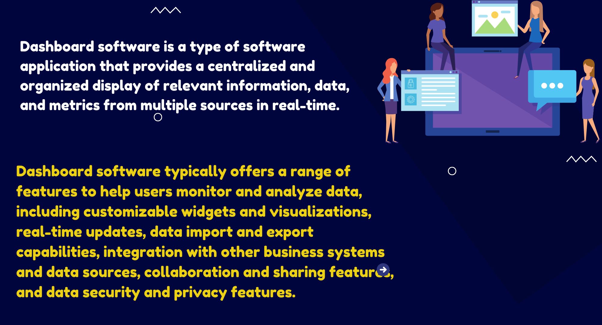
Dashboard software is a type of software application that provides a centralized and organized display of relevant information, data, and metrics from multiple sources in real-time. It is designed to give users a quick overview and easy access to the most important information they need to monitor and manage their business operations, such as sales performance, customer behavior, and resource utilization. Dashboards are customizable and can be tailored to meet the specific needs of different departments, roles, and users. The dashboard software connects to your multiple files and data sources to analyze, track and display key performance indicators (KPI). The dashboards are easily customizable and help departments in fast decision-making processes. Display of data is through charts and graphs.
What is Dashboard Software
Users have the option of customizing existing dashboards or creating their own through a variety of templates offered by service providers. The dashboard visuals can be shared to the public through an URL. Dashboard software open up data to further collaboration by various departments in the organization. This has the added benefit of eliminating duplication of resources.
What are the features of Dashboard Software?
Dashboard software typically offers a range of features to help users monitor and analyze data, including customizable widgets and visualizations, real-time updates, data import and export capabilities, integration with other business systems and data sources, collaboration and sharing features, and data security and privacy features. Some dashboards also offer advanced features such as data forecasting, predictive analytics, and machine learning algorithms. Many dashboard software products offer flexible deployment options, such as cloud-based or on-premises, as well as mobile access for viewing data on-the-go. The specific features and capabilities of dashboard software can vary widely, so it is important to carefully evaluate the needs of your organization to determine the best solution for your use case.
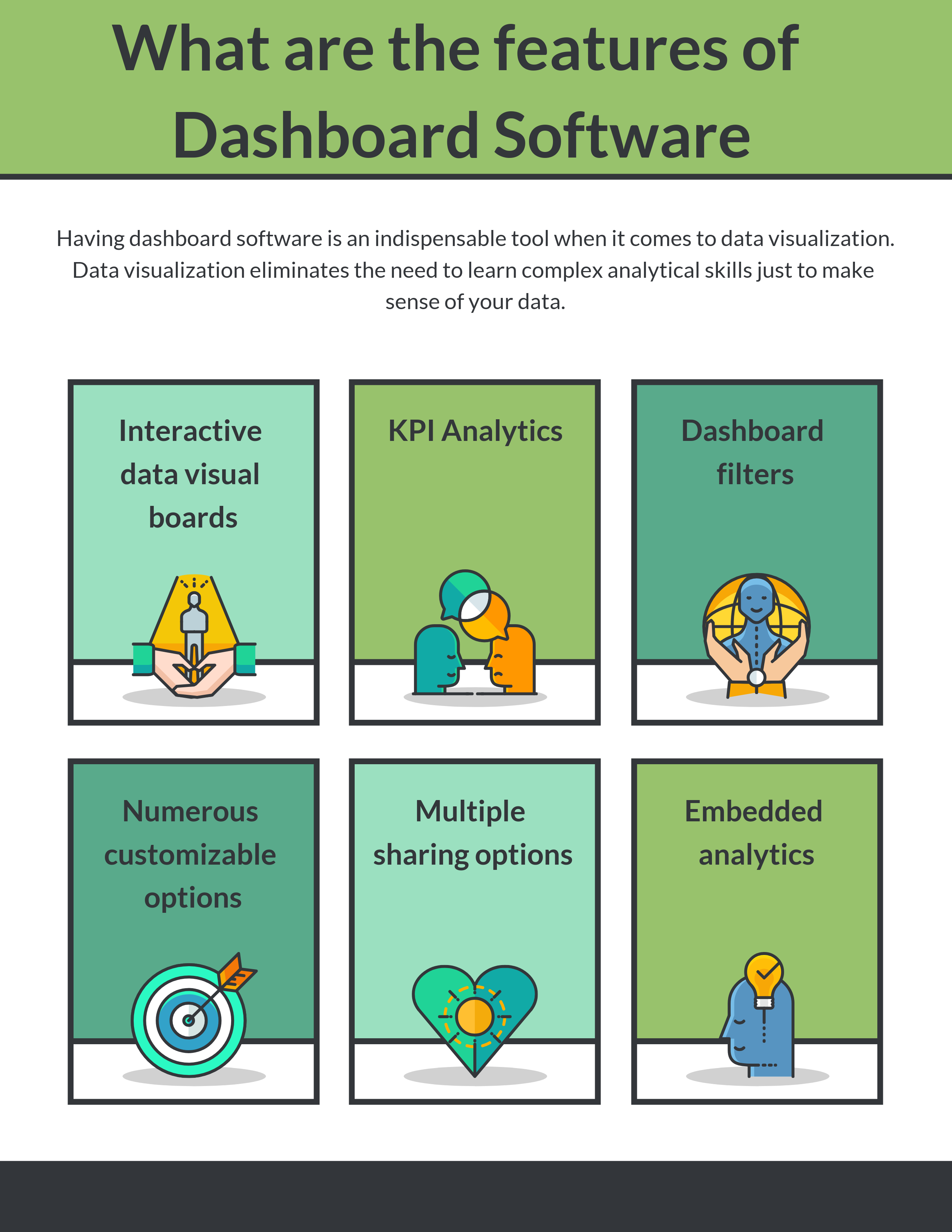
Having dashboard software is an indispensable tool when it comes to data visualization. By aggregating data from different sources and presenting them in the form of charts and graphs, managers get a bird’s eye view of the health of the organization. Data visualization eliminates the need to learn complex analytical skills just to make sense of your data.
The dashboard software presents data in an easy to understand format. Users can customize the dashboards through fonts, colors, or animations. They can also share the data visuals to the public through an Url. The software allows greater collaboration among company departments and this leads to faster decision-making processes. Companies that leverage on dashboard software in their business processes tend to enjoy a competitive advantage.
You may like to read: What is Dashboard Software?, Top Dashboard Software , and Open Source, Free and Top Dashboard Software
What are the features of Dashboard Software
- Interactive data visual boards: This is the hallmark of any dashboard software. KPIs are presented through charts, bar or line graphs. Through visual dashboards managers can get better insights to their businesses. The tools used are intuitive hence making it easier to understand and maneuver. The software offers unlimited options when it comes to customizing your dashboard. This means you can monitor various KPI metrics critical to the success of the business side by side.
- KPI Analytics: People have being using data for KPI analytics for ages but with dashboard software availability on cloud, various departments have access to the same data. The software can be accessed on desktops, tablets, and mobile phones, which enhances real-time access to data. Links can be created for both public and private access. Today, you have live stream of KPI metrics online. Access to data is 24/7 and this allows companies to take immediate action during crisis.
- Dashboard filters: Dashboard filters have the power to aggregate data from multiple sources into one visible chart or graph. By leveraging on multiple filters, managers get to have a bird’s eye view of the health of the business without necessarily needing to pull out several chats. You can have the multiple filters display all these information in one screen but with multiple charts/graphs. With just a few clicks, you can drill down a particular chart to specifics. You can also filter the information being displayed by geographical regions e.g. display the overall sales targets for a particular sales region. Instead of creating separate dashboards each covering a region you can have all these information displayed in one easy to access dashboard.
- Numerous customizable options: When it comes to the options for customizing your dashboard, your choices are limited. You can change your fonts, colors, themes and even styles. You can also choose to have your results displayed as charts, line graphs or tables. The availability of these numerous customization options means you can view data as you wish without being dictated by the software. All customization options do not require coding they operate through a simple drag and drop feature. Movement through the dashboard is through easy to use tabs – these eliminates the need to open multiple screens for data analysis. Dashboard software also come with the option of adding animations to your screens. This makes them more visual and interactive.
- Multiple sharing options: Today, it is all about data. Dashboard software allow users within the organization to share existing data with other departments. Most have URL links for data sharing with external users. When data is shared with the public it allows stakeholders like investors, customers and other interested parties to know what is going on in the company. You can also share your data visualization through email. The software comes also with various export options to PDF or PNG. The export features are flawless and you will not have cases of broken charts or graphs. This comes in handy when you are making boardroom presentations.
- Embedded analytics: While the idea of sharing public URLs is welcome, there is a desire to move further through embedded analytics. This allows you to integrate your dashboards into your intranet, websites, or internal applications. Embedded analytics opens up data to further collaboration and makes it accessible by all parties in the organization.
What are the benefits of Dashboard Software?
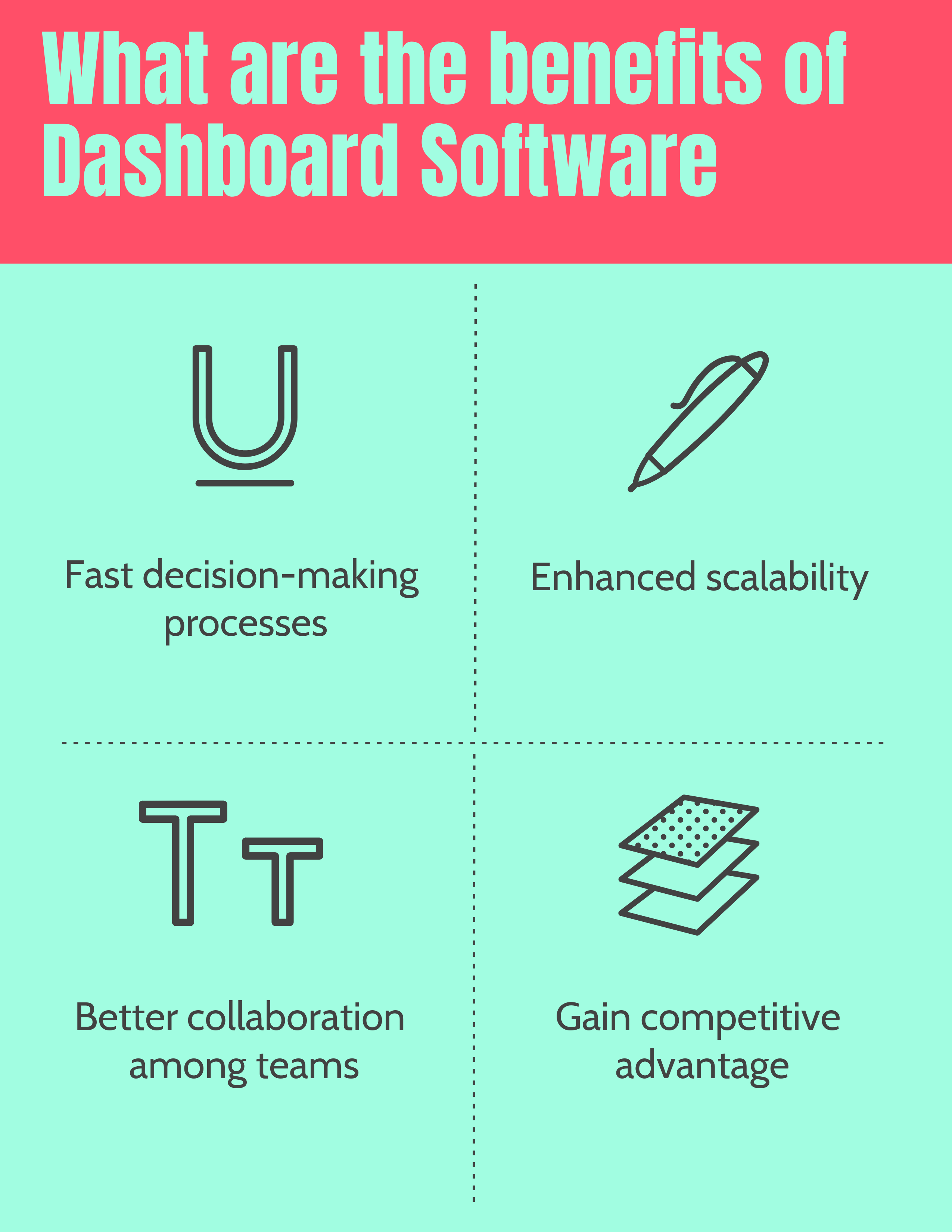
Dashboard software offers a number of benefits that can improve the efficiency, productivity, and decision-making of an organization. Some of the key benefits of dashboard software include real-time visibility into critical data and performance metrics, the ability to make data-driven decisions, improved collaboration and communication among team members, and streamlined business processes. Dashboard software can provide improved data accuracy, increased transparency, and better risk management, as well as the ability to easily identify trends and patterns in data, and track progress towards goals and objectives. Overall, dashboard software can help organizations to optimize their operations, make better decisions, and drive growth and success.
What are the benefits of Dashboard Software
- Fast decision-making processes: When data is fragmented there is the likelihood of duplication of resources. Dashboard software centralize the data for easy access by all departments of an organization. This results in fast and efficient decision-making processes. Graphs and charts are used to aggregate data from multiple sources and this helps in comparative analysis.
- Enhanced scalability: As your company grows so does demand for better data analysis. Dashboard software are designed with integration in mind as such they allow adoption by multiple systems and users. Integration is supported through API and advanced scripting options. Most of the dashboard software are enterprise compliant meaning they can support large data sets.
- Better collaboration among teams: When teams can view key KPI metrics they are better able to make critical decisions and work towards common goals. Teams are better able to interact and gain more insights through reports, notifications and various notes attached to the KPIs. KPI metrics enable managers to have a birds-eye view of the business. Real-time access to information ensures that critical decisions are made when it matters the most.
- Gain competitive advantage : Proper use of KPI metrics helps companies gain important insights into their production and operational processes. This allows them to make crucial adjustments to their business strategies. Customer metrics helps companies offer differentiated products hence boosting productivity. Dashboard software operate through the centralization of data, this saves time and resources as the learning curve is reduced.
What are the Top Dashboard Software?


Sisense
Sisense simplifies business analytics for complex data. Powered by In-Chip and Single Stack technologies Sisense delivers unmatched performance, agility and value, eliminating much of the costly data preparation traditionally needed with business analytics tools and providing a single, complete tool to analyze and visualize large, disparate data sets without IT resources. Sisense’s expertise in complex data includes both large data sets and data derived from multiple, disparate sources. Sisense leverages In-Chip analytics to dramatically improve business users’ access to advanced analytics on low-cost, commodity machines without the need for special data warehouse tools or dedicated IT staff. One-click formulas offer…
•Join data from multiple sources
•Drag & drop joining of multiple data sources
•Build interactive dashboards with no tech skills
•Share interactive dashboards
•Provide users the freedom to query data in real-time
Contact for Pricing
• Single-Stack™ architecture
• Sisense innovative In-Chip™ engine
• Groundbreaking. Powerful. Simple.
• IoT, machine learning, and AI in cutting edge BI platform
• Easily and quickly get the answers they need from complex data
• Easy to connect your data, get up and running instantly and deliver fast results
Sisense for Cloud Data Teams
Sisense for Cloud Data Teams formerly Periscope Data is an end-to-end BI and analytics solution that lets you quickly connect your data, then analyze, visualize and share insights. Periscope Data can securely connect and join data from any source, creating a single source of truth for your organization. Perform BI reporting and advanced analytics operations all from one integrated platform. Communicate insights more effectively by selecting from Periscope Data’s wide range of visualization options (including standard charts, statistical plots, maps and more) and instantly share real-time insights via direct linking, email or Slack. Periscope Data is a data analysis tool that unifies business data across multiple…
•One Tool For All Your Data Needs
•Enable data experts to answer more complex questions, quickly.
•SQL Editor Built By Experts, For Experts
•Advanced Analytics With Python And R
•Intuitive Drag-and-Drop Interface
Contact for Pricing
•Enable data experts to answer more complex questions, quickly.
•Intuitive Drag-and-Drop Interface
•Ensure Control, Consistency and Trust
•One Tool For All Your Data Needs
•Tailored For Every Workload
•Combine all of your data sources into a single platform for powerful analysis and insights
iDashboards
iDashboards provides the best experience when it comes to managing data and dashboards alike. Customize and present better charts during presentations using iDashboards. Incorporate images, videos and company logos to various charts or even create unique theme for each dashboards. It also provides huge color selection and a lot of personalized operations just to make sure every chart provide a good impression. iDashboards’ Enterprise software is a programming-free dashboard solution that allows you to easily combine multiple data sources and build visually engaging dashboards through user-friendly drag-and-drop tools. Connection all information with iDashboards is also made possible with an ease.…
•Hosted in Cloud
•Unlimited Dashboards
•Analytics & Reports
•Excel Auto-Uploader
•Scheduled Reports
•Street-Level Mapping
Custom Quote
•Unlimited Dashboards
•Analytics & Reports
•Excel Auto-Uploader
• Incorporate multiple types of outputs from images, videos and company logos
• Real-time alerts
• Easy to use interface
Microsoft Power BI Pro
Microsoft Power BI, is a cloud based, software as a service, self-service business intelligence solution for non technical business users. With just any browser or a Power BI mobile app, customers can keep a pulse on their business via live operational dashboards. They can deeply explore their business data, through interactive visual reports, and enrich it with additional data sources. The first version of Power BI was launched last February and since then customers have used it to gain powerful insights, helping them become more productive and competitive. Power BI let you connect to your data in minutes, with built…
• Noisy neighbors isolation
• Huge dataset storage and no user quotas
• Higher dataset refresh rates
• Large datasets
•Power BI Pro-$9.99- Monthly price per user
•Power BI Premium-$4,995 - Monthly price per dedicated cloud compute and storage resource
• Noisy neighbors isolation
• Huge dataset storage and no user quotas
• Higher dataset refresh rates
• Incremental refresh
• Pinning Datasets to Memory
• Dedicated Data Refresh Nodes
SAP Lumira
SAP Lumira is a self service Business Intelligence solution from SAP which allows business users to access, transform, visualize data, analyze the trends, and share insights on the BI platform or in the cloud. SAP Lumira software combines self-service BI discovery and visualization with interactive dashboards and analytic applications – all in one solution that rapidly promotes insight across the organization. Deliver faster insights easier, with a simple interface for self-service data visualization, data connectivity, and advanced development tools.Enable IT to manage, govern, and deliver fresh data to business users to uncover hidden insights in real-time and drive decision-making, eliminating…
• Connects To Any Data Set
• Uncover Hidden Trends
• Slice It. Dice It. Visualize It.
• Create Your Own Story
• SAP Lumira, standard edition - USD 185.00 per user
• Create beautiful and interactive maps, charts, and infographics
• Import data from Excel and many other sources
• Perform visual BI analysis using intuitive dashboards
• Manipulate and transform data with ease
• Connect to your data big and small
• Combine visualizations into storyboards
SAP Crystal Dashboard Design
SAP Crystal Dashboard Design software is used to create insightful dashboards from any data source with point and click ease. With SAP Crystal Dashboard Design, business can create professional dashboards from any type of live company data via the universe semantic layer in SAP Crystal Server software, Web services, or Microsoft Excel spreadsheets. With a feature-rich library of ready-to-use charts, maps, gauges, drill-down charts, and progress bars, plus a point-and-click interface for connecting prebuilt charts and graphics to data, you can create interactive data visualizations based on Adobe Flash and Adobe Flex technologies . SAP Crystal Dashboard Design Turn raw…
• Monitor performance across your organization with key performance indicators (KPIs)
• Visualize trends and use “what if” analysis to understand the impact of business change
• Consolidate reports and live data from multiple sources into a single dashboard
• Share dashboard views online or via familiar tools such as Microsoft Office and Adobe PDFs
• SAP Crystal Dashboard Design 2016 - USD 495.00 per user
• Transform data into engaging, interactive dashboards
• Get a holistic, actionable view of your business with SAP Crystal Dashboard Design
• Monitor performance across your organization with key performance indicators (KPIs)
• Extend the reach of dashboard functionality by integrating dashboard visualization components into IBM WebSphere Portal and Microsoft SharePoint.
• Turn dashboards into WebSphere portlets easily – without coding
• Provide Microsoft SharePoint users with interactive charts, graphs, and dashboards
Tableau Desktop
Tableau Software helps people see and understand data. Tableau helps anyone quickly analyze, visualize and share information. Tableau Desktop is a product that everyone can use to ask new questions, spot trends, identify opportunities, and make data-guided decisions with confidence. Tableau’s Data Engine lets you extract data for ad-hoc analysis of massive data in seconds. It combines advances in database and computer graphics technology so you can analyze huge datasets on a laptop. Tableau is 10-100x faster than existing solutions. It's designed to support how people think.Tableau Desktop is a product that everyone can use to ask new questions, spot…
• Get actionable insights fast
• Connect to more data
• Answer deeper questions
• Put your data on the map
• Let everyone in on it
• Tableau Creator - $70 USD/user/month
• Big data, live or in-memory
• Sharing and collaborating securely
• Designing for a mobile-first world
• Get actionable insights fast
• Connect to more data
• Answer deeper questions
IBM Cognos Analytics
IBM Cognos Analytics offers smarter, self-service capabilities so you can quickly and confidently identify and act on insight. The engaging experience empowers business users to create and or personalize dashboards and reports on their own while providing IT with a proven and scalable solution that is available on premises or on the cloud. Cognos Analytics is ready when you are with a unified experience that works the same on web or mobile devices, enabling you to quickly find, analyze, create and share insight. IBM Cognos Analytics introduces smarter self-service that guides you in generating insights from data for impressive and…
• Dashboarding
• Storytelling
• Reporting
• Support for Planning Analytics
• Data server
• Contextualized smart search
• Trial - Starting at $1,990.00 USD per month
• IBM Cognos Analytics Workgroup Edition on Cloud - Starting at $1,990.00 USD per month
• Standard - Starting at $10,100.00 USD per month
• Enterprise - Starting at $133,000.00 USD per month
• Intuitive interface helps all users quickly author content
• Dashboards can be created using drag and drop on mobile device or desktop
• Automatic recommendation of the best visualizations for particular data Templates and styles let you format reports instantly
• Direct reporting from data sources
• Effortlessly combine data sources
• Automatic data model generation based on keywords
ThoughtSpot
ThoughtSpot offers search-driven analytics for enterprises. The company allows users to search and analyze data, ask questions, get instant charts, analyze company data, build reports, share data, and offers dashboards. It serves communication, retail, financial service, healthcare and life science, and manufacturing sectors. ThoughtSpot's allows for non-technical individuals to conduct a self-service data analysis search. ThoughtSpot's relational search engine can analyze information from any data source, including point of sale data, data warehouses, and social media sites. Search-Driven Analytics allows analyzing data and creating reports and dashboards in seconds. There is no need for SQL expertise or lengthy training sessions…
•Guided Search Experience
•On-the-Fly Calculations
•100% Accuracy
•Security
•Unlimited Data Scale
•Easy to manage
•Unlimited Users
From $75,000
•DataRank
•AutoJoins
•PopCharts
• Instant data access
• Guided search experience
• On the fly calculations
GoodData
The GoodData platform includes advanced distribution and product lifecycle management features to automate the process of maintaining one-to-many cloud deployments. GoodData provides a highly engaging guided analytic exploration experience that drives actionable insights by teaching users best practice techniques through recommendations inside the interface. GoodData’s dashboards are responsive, mobile optimized, and include built-in alert, email and collaboration features to promote sharing across the organization GoodData provides groundbreaking BI for data monetization to enterprises, independent software vendors, and system integrators who seek to unlock the value of data for their business networks with engaging, one-to-many analytics. The intelligent analytics distribution platform…
• Deliver Packaged Analytics
• Accelerate Time-to-Market without Compromising Functionality
• Enable Hundreds of Thousands of Business Users to Operate on Massive Datasets
• Boost Security and Compliance
• Seamlessly Embed Analytics In-Context
• Deliver Powerful Analytics
• Technical Capabilities
• Free version
•Growth- 200 per year per customer
•Enterprise- Contact for Pricing
•Operational reporting, strategic analytics and exploratory analytics
•Mobile support and Email alerts
•Responsive visualizations throughout
•Centralized provisioning, subscriber, and lifecycle management
•Benchmarks, scorecards, and data enrichment that increase your business network insights
•Efficient analytics authoring for distribution to network
Datapine Business Intelligence
Datapine provides a scalable SaaS, data analysis tool that gives customers fast and easy access to their business intelligence data without the need for any SQL or database knowledge by using an intuitive drag & drop interface to analyze the database. The result is displayed as a chart or as a table and can be used later on for internal and external reporting purposes. Within minutes customers can connect datapine to their existing databases or external interfaces, such as Google Analytics. Datapine enhance dashboards with style elements such as headlines, text boxes and images and provide optional interactive control elements…
• Ad hoc queries
• Drag & Drop UI
• Powerful filters
• Full tablet support
• Perform advanced Calculations
Contact for Pricing
• Create Custom Columns
• Use familiar excel expressions
• Modify text and date fields
•Online Data Visualization Tools
•Dashboard Designer
•Online Data Analysis Tools
Datapine Business Intelligence
MicroStrategy
MicroStrategy makes sophisticated functionality accessible to every user, from administrators to business analysts. MicroStrategy makes it easy to seamlessly connect to any enterprise resource, including databases, mobile device management (MDM) systems, enterprise directories, cloud applications, physical access control systems, and more. MicroStrategy delivers a broad set of business intelligence services that can be deployed on-premises with MicroStrategy Server or via the MicroStrategy Secure Cloud. This service-oriented architecture dynamically assembles metadata objects and provides the core analytical processing power for any business intelligence project. MicroStrategy analytics platform meets the needs of business and IT. It empowers organizations to make sense of…
• Low total cost of ownership
• Enterprise readiness.
• Ease of use.
• Self-service analytics
• Advanced analytics
$600 per user
Contact for Pricing
• Enterprise Assets
• Tools
• Metadata Repository
•Data Visualization Software
•Dashboard Software
•Reporting Software
JReport
Jinfonet Software, is a leading provider in Java reporting, and features Visual Analysis, a new way to enable self-service interactive data analysis powered by high performance in-memory cubes. Visual Analysis in JReport allows report developers and end users to easily transform their data into rich visualization. With instant visual feedback and on-screen drag and drop actions, users can quickly adjust the dynamics of their data visualization resulting in faster discovery of actionable information. Components created by Visual Analysis can be reused in JDashboard for seamless compatibility. Moreover, the intuitive Visual Analysis UI requires a minimal learning curve with no formal…
• Embedded BI
• Dashboards & Reports
• Performance & Scalability
• Data Visualization
Contact for Pricing
• Self-Service BI
• Ad Hoc Reporting
• Seamless Integration
• Easy Dashboards
• Visual Analysis
• Geo Analysis
Knowi
Knowi is an adaptive intelligence for modern data and a business intelligence platform that unifies analytics across multi-structured, unstructured and structured data. There is no need for ETL or ODBC drivers. Users just connect the datasource(s) then Knowi does a schema on read, and users start building queries. Simple as that. Users can create blended datasets by joining data from NoSQL, SQL, REST-API, RDBMS and even file based sources in a matter of minutes. If users are ready to become a data-driven enterprise, users just need to insert the algorithms into the analytics workflow to automatically trigger notifications or actions.…
• Native Integration to Your Enterprise Data
• Drag & Drop Query Generation
• Blend Data from SQL and NoSQL Sources Without Moving It
• Business-Driven Insights in Minutes
• Easily Embed in Your Data Applications
• Machine Learning and Trigger Data-Driven Actions
•Contact for Pricing
• Dashboards,
•Datasources
•Widgets
•Native NoSQL, SQL, REST API
•Cloud or On-premise Deployment
•Instant Visual Insights
Pyramid Analytics
Pyramid Analytics deliver a Governed Data Discovery and Enterprise Business Analytics platform that gives the power of analytics into the hands of every user, from expert analyst to business executive to IT professional. The BI Office Suite is architected with centralized security and content in addition to being able scale up and out effortlessly, load balanced over as many servers as required. Pyramid Analytics main product, BI Office, is a web-based business analytics suite for analytics, dashboards, reporting and data mining designed for taking BI to the cloud.BI Office is made up of these core applications: Data Discovery, Data Modeling,…
• Data Discovery, Story Boards and Publications all out of the box
• Increase the return on your SAP investments
• Self-service capabilities without security or data risks
• Easy to use, familiar interface for short ramp up time
Contact for Pricing
• Governing Data Analytics
• BI Analytics on your Mobile
• Cloud BI
• Tiered licensing model to maximize value on investment
• Access to Your Data From Anywhere
• Reduce the Cost of Design and Distribution
You may like to read: How to Select the Best Dashboard Software for Your Business, Top Best Practices in Dashboard Software, Top Chart Builder Software
What is Dashboard Software?
The dashboard software connects to your multiple files and data sources to analyze, track and display key performance indicators (KPI). The dashboards are easily customizable and help departments in fast decision-making processes. Display of data is through charts and graphs.
What are the features of Dashboard Software?
The features of Dashboard Software include interactive data visual boards, KPI analytics, dashboard filters, numerous customizable options, and multiple sharing options.
What are the benefits of Dashboard Software?
The benefits of Dashboard Software include fast decision-making processes, enhanced scalability, better collaboration among teams and gain competitive advantage.
What are the Top Dashboard Software?
Sisense, Periscope Data, iDashboards, Microsoft Power BI Pro, SAP Lumira, SAP Crystal Dashboard Design, Tableau Desktop, IBM Cognos Analytics, ThoughtSpot, GoodData, Datapine Business Intelligence, MicroStrategy, JReport, Knowi, Pyramid Analytics are some of the Top Dashboard Software.


By clicking Sign In with Social Media, you agree to let PAT RESEARCH store, use and/or disclose your Social Media profile and email address in accordance with the PAT RESEARCH Privacy Policy and agree to the Terms of Use.