
77 Open Source, Free and Top Dashboard Software

Dashboard is a user interface that displays information and key performance indicators (KPIs) in a visually appealing and easy-to-read format. It provides a centralized view of data and allows users to monitor and analyze information in real-time. Dashboards are commonly used in business, finance, and operations to track metrics such as sales, revenue, and customer satisfaction. They can also be used in other industries and applications to visualize data and monitor performance. Dashboards can be interactive and allow users to filter, sort, and drill down into the data to get a more detailed view.
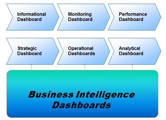
Dashboards are easy to read, real time user interface, which shows a graphical presentation of the current status and historical trends of key performance indicators to enable informed decisions. Dashboards can be broken down according to role and are either strategic, analytical, operational, or informational.
Strategic dashboards provide the quick overview that decision makers need to monitor of the business such as performance, and forecasts. Strategic dashboards benefit from static snapshots of data such as daily, weekly, monthly, and quarterly. Analytical dashboards typically support interactions with the data, such as drilling down into the underlying details.

What are Dashboard Software
Dashboards for monitoring operations are often designed differently from those that support strategic decision making or data analysis and often require monitoring of activities and events that are constantly changing and might require attention and response at a moment's notice.
What are Dashboard Software
Dashboard software is a type of application that provides a platform for collecting, organizing, and visualizing data in real-time. It allows users to create and display dashboards to monitor key performance indicators (KPIs) and other important metrics. Some of the key features of dashboard software include data integration, data visualization, customization, interactivity, and real-time updates. Data can be imported from multiple sources such as databases, spreadsheets, and APIs, and can be displayed using a variety of graphical representations, such as charts, tables, and graphs. Users can also adjust the layout, color scheme, and other visual elements to meet specific needs. Dashboards can be interactive, allowing users to drill down into data and explore relationships between data sets. These tools provide organizations with the ability to quickly and easily track performance, make data-driven decisions, and improve overall business operations.
It provides a visual presentation of performance measures, the ability to identify and correct negative trends and measure efficiencies and inefficiencies. Dashboards enable the business to generate detailed reports showing new trends and provides the ability to make more informed decisions based on collected business intelligence.
You may like to read: What is Dashboard Software?, Top Best Practices in Dashboard Software and How to Select the Best Self Service Dashboard for Your Business .
Open Source, Free and Top Dashboard Software
Open Source, Free and Top Dashboard Software
What are the Top Open Source Dashboard Software: Seal Report, ReportServer Community Edition, Metabase, Shiny are some of the Top Open Source Dashboard Software.
What are the Top Free Dashboard Software: Google Data Studio, Cyfe, QlikView Personal Edition, Databox, Cluvio, Kyubit Business Intelligence, Bilbeo, Arcadia Data Instant are some of the Top Free Dashboard Software.
What are the Top Dashboard Software: Sisense, Sisense for Cloud Data Teams, iDashboards, Microsoft Power BI Pro, SAP Lumira, SAP Crystal Dashboard Design, Tableau Desktop, IBM Cognos Analytics, ThoughtSpot, GoodData, Datapine Business Intelligence, MicroStrategy, JReport, Knowi, Pyramid Analytics, Birst BI, WebFOCUS Platform, Dimensional Insight, SAP BusinessObjects BI, Domo, Oracle Business Intelligence, Qlik Sense Enterprise, Phocas BI Software, Dundas BI, Redash, Exago Business Intelligence, Yellowfin, AVORA, Cluvio, SAP Crystal Server, BIME Analytics, SAS Enterprise BI Server, BDB Platform, Zoomdata, DataHero, Looker, Izenda, InetSoft Style Intelligence, TARGIT Decision Suite, ClicData, DBxtra, AnswerRocket, Yurbi, Logi Analytics, Panorama Necto, Bright Gauge, Grow, Visual KPI, FusionCharts, ORBIT Enterprise, DataLion, Viur, Lumalytics, AppInsights, InfoCaptor Dashboard, InetSoft Style Scope, Easy Insight, Klipfolio, Geckoboard, Slemma, Bilbeo, Dashboard Builder, Panintelligence, OQLIS, Nucleus are some of the Top Dashboard Software.
What are the features of Dashboard Software?
Dashboard software typically offers a range of features designed to help users collect, organize, and visualize data in real-time. Some of the key features include data integration, data visualization, customization, interactivity, and real-time updates. Data integration allows users to import data from multiple sources, such as databases, spreadsheets, and APIs, and bring it together in one centralized location. Data visualization uses a variety of graphical representations, including charts, tables, and graphs, to display data in a visually appealing and easy-to-understand format. Customization allows users to adjust the layout, color scheme, and other visual elements to meet specific needs. Interactivity allows users to drill down into data and explore relationships between data sets, providing a more detailed view of the information. Finally, real-time updates ensure that data is always up-to-date, providing users with the most current information. Some dashboard software may offer features such as data analysis, report generation, and collaboration tools that allow teams to work together and share insights. Overall, the features of dashboard software help organizations track performance, make data-driven decisions, and improve overall business operations.
- Predefined dashboard themes, with the ability to use any theme.
- Drill up, Drill down, Filtering etc
- Data Connectivity and Data Management
- Numerous Chart Options
- Collaboration and Sharing Options
- Embedded Analytics
- Mobile Availability
- User Security
You may like to read: Top Dashboard Software ,How to Select the Best Dashboard Software for Your Business, and Buyer Guide: Selecting the Right Dashboard Type for Your Business.

Top Free Dashboard Software


Google Data Studio
Google Data Studio provides easy access to all the data sources for the business to make better decisions. Regardless of whether you’re a business user or a data analyst, and no matter where the data lives, simply access it with a pre-built Data Studio connector. Data Studio handles the authentication, access rights, and structuring of the data. Once a data source is connected, the underlying dimensions and metrics are readily available for use in calculations, transformations, and visualizations. With Data Studio you’ll be able to transform your raw data into the metrics and dimensions needed to create easy-to-follow reports and…
•Visualize your data through highly configurable charts and tables.
•Easily connect to a variety of data sources.
•Share your insights with your team or with the world.
•Collaborate on reports with your team.
•Speed up your report creation process with built-in sample reports
Free
•A visual editor for easy creation of reports and dashboards.
•A rich library of visualizations to reveal the real story behind the data.
•Fully custom design and style controls so you can make it your own.
•Dynamic and interactive report controls based on time periods, geographies, segments
•Seamless integration between data, analysis, and reporting for easy workflows.
Cyfe
Cyfe, is a self-service cloud based business intelligence dashboard app, designed to analyze, transform and report data from different integrated sources of business intelligence. It is a freemium application to track and monitor all business metrics in one single place. Cyfe Dashboard is an online dashboard platform for building real-time business dashboard.Cyfe provides a browser-based dashboard that allows business users to connect to many data services, automate data retrieval, analyze, and then transform and visualize the data for business intelligence. The product targeted non-technical end user by providing them a schema-less architecture to easily connect to data sources, and separates…
• Monitor everything
• Prebuilt widgets
• Custom data source
• Real time reports
• Historical data
• Data exports
• Free $0/mo
• Solo $29/mo
• Monitor everything
• Prebuilt widgets
• Custom data source
• Unlimited dashboards
• View data past the last 30 days
• Automatically rotate one or more dashboards for your bug screen monitor
QlikView Personal Edition
QlikView, is the leading Business Discovery Platform, providing user driven business intelligence (BI) to a variety of organizations worldwide. QlikView makes data associative, creating easily-understandable visual relationships across multiple, complex data sources. It’s also mobile, social and collaborative. QlikView Personal Edition is the full QlikView Desktop product that is run on a machine without a customer or partner license assigned to it. With the QlikView Personal Edition license, everyone is free to create QlikView documents for personal use. If at any point you or your organization decides to acquire a full QlikView license, this Personal Edition installation will automatically become…
•Consolidate data from Multiple sources
•Collaboration, Visualization, Search, Graphics
•Dashboard, Mobile BI
•Bring together all your data and unlock its full potential
•Searching across all data, interacting with dynamic apps, dashboards and analytics
•Accessing, analyzing and capturing data from mobile devices .
•Consolidate from multiple sources into a single application,
•Exploring the associations in data, enabling social decision making through secure,
•Real time collaboration, visualizing data with engaging, state-of-the-art graphics,
•QlikView Personal Edition works with local files only and cannot share QlikView file with another unregistered user, or load a QlikView file from another user.
•Not possible to import an entire document layout sheets/objects/security settings, etc. without the data.
Databox
Business Analytics platform built to help you understand what's going on with your business. KPIs from cloud services, spreadsheets, database in one place. From a morning briefing that makes sure you start the day knowing where you stand and how you’re progressing towards your goals, to smart alerts throughout the week that let you know when something needs your attention, Databox makes sure you’re never in the dark about the data that matters most to you. The Databox mobile app provides data access and business insights through an intuitive mobile experience. Through an actionable, personalized experience that enables collaboration, Databox…
•Data Connections
•Datawalls
•Hourly Data refresh
•Databox Designer
•Query Builder
•Company Branding
•Custom domain
•Free $0
•Basic $49/monthly
•Business $249/monthly
•Data Connections
•Datawalls
•Hourly Data refresh
• All KPI's in one place
• Beautifully mobile oriented
• Create real-time reports
Cluvio
Cluvio is a cloud analytics platform for startups and data-driven teams, trusted by over 100 companies. Users can use SQL and R to analyze their data and in a few minutes create beautiful, interactive dashboards for their entire company. There is a wealth of information hiding in the data in the users’ database that is just waiting to be discovered. Daily active users, monthly recurring revenue, signups per day. With Cluvio, users can see the most important KPIs on interactive, real-time dashboards anywhere, anytime. Users can receive alerts for conditions that users define - a sudden drop in number of…
• Advanced Report Creator
• Interactive Dashboards
• SQL Alerts
• Bank-grade security
• EU Data Protection
• Share Dashboards via Link
• Share Dashboards with your Colleagues
• Your data on the wall
• FREE
• Pro $ 279 /mo.
• Business $ 669 /mo
• Enterprise $ 2250+ /mo.
• Custom Dashboard Filter
• Interactive Dashboards
• SQL Alerts
•Share dashboards within your company
•Share dashboards via link
•Share via email
Kyubit Business Intelligence
Kyubit Business Intelligence is a Business intelligence tool that is designed for Microsoft BI environment and 'Analysis Services' (Multidimensional and Tabular models) OLAP analysis using web browser. Its dashboard software can be used to create visual insights and metrics and also collaborate with other users while monitoring business data and managing KPIs. Kyubit Business Intelligence allows users to convert their analysis to PDF or Excel file, share with the team or subscribe to fresh data at scheduled time. It can also Analyze OLAP data with descriptive Grid view or visual Chart view. Kyubit Business Intelligence’s interactive dashboard allows users to…
•Modern big data architecture
•Cloud or on-premise
•Extensible data model
•Scalable for enterprise
•Revenue distribution models
•Based on multiple channels
•Free Personal Edition
•Team Edition $295 Per Year
•Standard Edition $495 Per Year
•Company Edition $895 Per Year
•Modern big data architecture
•Cloud or on-premise
•Extensible data model
•Interactive Dashboards can be accessed from desktop or mobile devices.
•Kyubit BI Tools user interface includes multilingual support
•Works as on-premise BI server or part of your cloud BI environment
Bilbeo
Bilbeo is a web-based KPI Dashboard Software that helps managers to improve business performance by automatically transforming simple metrics into an intelligent dashboard that uncovers company’s weak spots. Bilbeo's Business Intelligence Solution is a cloud-based, fully integrated Business Intelligence Dashboard for small-to-big-sized businesses. Bilbeo is a SaaS Business Intelligence tool that enables managers focus on critical KPIs and improve Business Performance using an intuitive Business Dashboard that recognizes and alerts on poor performance. Bilbeo's auto-populated dashboard is ready to use in minutes and provides actionable recommendations based on data mining techniques, which anyone can understand. It provides actionable insights, accessible…
•Auto-Populated Dashboard
•Smart Alerts
•Leading Indicators Algorithm
•Custom Reports
•Unlimited Dashboards
•Collaboration
•Free $0/mo
•ESSENTIAL $49/mo
•PRO $149/mo
•Auto-Populated Dashboard
•Smart Alerts
•Leading Indicators Algorithm
• Control and understand the root-cause of your business making it easier and actionable to manage performance
• Provides an actionable view of your business performance
• Uncover the underlying leading kpis that drive the business performance
Arcadia Data Instant
Arcadia Data Instan uses smart acceleration to enable ultra-fast analytics and BI with agile drag-and-drop access. Arcadia Data Instant provides an in-cluster execution engine for scale-out performance on Apache Hadoop and other modern data platforms with no data movement. Arcadia Data Instant supports visualizations on Apache Kafka. Through this, users have an excellent platform to download a kit quickly and get started with exploring visualizations of Kafka topics. The key features offered by Arcadia Data Instant include connect, discover, model, visualise, interact, manage, scale, optimize, security, share and publish, and advanced analytics. The connect feature allows accessing data inside Hadoop…
• The discover feature provides browse data sources, structure and content, with full granularity and transparency
• Set hierarchies and logical datasets, for blending visualizations across sources
• The visualize feature provides easy to use familiar web-based self-service drag and drop authoring
• Flow and funnel algorithms that make it easy to measure correlation
• Create semantic relationships across multiple sources
• Assemble dashboards and applications of visuals that show the user’s work
Contact for pricing
• The discover feature provides browse data sources, structure and content, with full granularity and transparency
• Set hierarchies and logical datasets, for blending visualizations across sources
• The visualize feature provides easy to use familiar web-based self-service drag and drop authoring
• Provides an in-cluster execution engine for scale-out performance on Apache Hadoop
• Achieve linear scalability of records with native in-cluster execution
• Simplifies deployment and monitoring with certified integration
You may like to read: How to Select the Best Executive Dashboard for Your Business.
Top Dashboard Software


Sisense
Sisense simplifies business analytics for complex data. Powered by In-Chip and Single Stack technologies Sisense delivers unmatched performance, agility and value, eliminating much of the costly data preparation traditionally needed with business analytics tools and providing a single, complete tool to analyze and visualize large, disparate data sets without IT resources. Sisense’s expertise in complex data includes both large data sets and data derived from multiple, disparate sources. Sisense leverages In-Chip analytics to dramatically improve business users’ access to advanced analytics on low-cost, commodity machines without the need for special data warehouse tools or dedicated IT staff. One-click formulas offer…
•Join data from multiple sources
•Drag & drop joining of multiple data sources
•Build interactive dashboards with no tech skills
•Share interactive dashboards
•Provide users the freedom to query data in real-time
Contact for Pricing
• Single-Stack™ architecture
• Sisense innovative In-Chip™ engine
• Groundbreaking. Powerful. Simple.
• IoT, machine learning, and AI in cutting edge BI platform
• Easily and quickly get the answers they need from complex data
• Easy to connect your data, get up and running instantly and deliver fast results
Sisense for Cloud Data Teams
Sisense for Cloud Data Teams formerly Periscope Data is an end-to-end BI and analytics solution that lets you quickly connect your data, then analyze, visualize and share insights. Periscope Data can securely connect and join data from any source, creating a single source of truth for your organization. Perform BI reporting and advanced analytics operations all from one integrated platform. Communicate insights more effectively by selecting from Periscope Data’s wide range of visualization options (including standard charts, statistical plots, maps and more) and instantly share real-time insights via direct linking, email or Slack. Periscope Data is a data analysis tool that unifies business data across multiple…
•One Tool For All Your Data Needs
•Enable data experts to answer more complex questions, quickly.
•SQL Editor Built By Experts, For Experts
•Advanced Analytics With Python And R
•Intuitive Drag-and-Drop Interface
Contact for Pricing
•Enable data experts to answer more complex questions, quickly.
•Intuitive Drag-and-Drop Interface
•Ensure Control, Consistency and Trust
•One Tool For All Your Data Needs
•Tailored For Every Workload
•Combine all of your data sources into a single platform for powerful analysis and insights
iDashboards
iDashboards provides the best experience when it comes to managing data and dashboards alike. Customize and present better charts during presentations using iDashboards. Incorporate images, videos and company logos to various charts or even create unique theme for each dashboards. It also provides huge color selection and a lot of personalized operations just to make sure every chart provide a good impression. iDashboards’ Enterprise software is a programming-free dashboard solution that allows you to easily combine multiple data sources and build visually engaging dashboards through user-friendly drag-and-drop tools. Connection all information with iDashboards is also made possible with an ease.…
•Hosted in Cloud
•Unlimited Dashboards
•Analytics & Reports
•Excel Auto-Uploader
•Scheduled Reports
•Street-Level Mapping
Custom Quote
•Unlimited Dashboards
•Analytics & Reports
•Excel Auto-Uploader
• Incorporate multiple types of outputs from images, videos and company logos
• Real-time alerts
• Easy to use interface
Microsoft Power BI Pro
Microsoft Power BI, is a cloud based, software as a service, self-service business intelligence solution for non technical business users. With just any browser or a Power BI mobile app, customers can keep a pulse on their business via live operational dashboards. They can deeply explore their business data, through interactive visual reports, and enrich it with additional data sources. The first version of Power BI was launched last February and since then customers have used it to gain powerful insights, helping them become more productive and competitive. Power BI let you connect to your data in minutes, with built…
• Noisy neighbors isolation
• Huge dataset storage and no user quotas
• Higher dataset refresh rates
• Large datasets
•Power BI Pro-$9.99- Monthly price per user
•Power BI Premium-$4,995 - Monthly price per dedicated cloud compute and storage resource
• Noisy neighbors isolation
• Huge dataset storage and no user quotas
• Higher dataset refresh rates
• Incremental refresh
• Pinning Datasets to Memory
• Dedicated Data Refresh Nodes
SAP Lumira
SAP Lumira is a self service Business Intelligence solution from SAP which allows business users to access, transform, visualize data, analyze the trends, and share insights on the BI platform or in the cloud. SAP Lumira software combines self-service BI discovery and visualization with interactive dashboards and analytic applications – all in one solution that rapidly promotes insight across the organization. Deliver faster insights easier, with a simple interface for self-service data visualization, data connectivity, and advanced development tools.Enable IT to manage, govern, and deliver fresh data to business users to uncover hidden insights in real-time and drive decision-making, eliminating…
• Connects To Any Data Set
• Uncover Hidden Trends
• Slice It. Dice It. Visualize It.
• Create Your Own Story
• SAP Lumira, standard edition - USD 185.00 per user
• Create beautiful and interactive maps, charts, and infographics
• Import data from Excel and many other sources
• Perform visual BI analysis using intuitive dashboards
• Manipulate and transform data with ease
• Connect to your data big and small
• Combine visualizations into storyboards
SAP Crystal Dashboard Design
SAP Crystal Dashboard Design software is used to create insightful dashboards from any data source with point and click ease. With SAP Crystal Dashboard Design, business can create professional dashboards from any type of live company data via the universe semantic layer in SAP Crystal Server software, Web services, or Microsoft Excel spreadsheets. With a feature-rich library of ready-to-use charts, maps, gauges, drill-down charts, and progress bars, plus a point-and-click interface for connecting prebuilt charts and graphics to data, you can create interactive data visualizations based on Adobe Flash and Adobe Flex technologies . SAP Crystal Dashboard Design Turn raw…
• Monitor performance across your organization with key performance indicators (KPIs)
• Visualize trends and use “what if” analysis to understand the impact of business change
• Consolidate reports and live data from multiple sources into a single dashboard
• Share dashboard views online or via familiar tools such as Microsoft Office and Adobe PDFs
• SAP Crystal Dashboard Design 2016 - USD 495.00 per user
• Transform data into engaging, interactive dashboards
• Get a holistic, actionable view of your business with SAP Crystal Dashboard Design
• Monitor performance across your organization with key performance indicators (KPIs)
• Extend the reach of dashboard functionality by integrating dashboard visualization components into IBM WebSphere Portal and Microsoft SharePoint.
• Turn dashboards into WebSphere portlets easily – without coding
• Provide Microsoft SharePoint users with interactive charts, graphs, and dashboards
Tableau Desktop
Tableau Software helps people see and understand data. Tableau helps anyone quickly analyze, visualize and share information. Tableau Desktop is a product that everyone can use to ask new questions, spot trends, identify opportunities, and make data-guided decisions with confidence. Tableau’s Data Engine lets you extract data for ad-hoc analysis of massive data in seconds. It combines advances in database and computer graphics technology so you can analyze huge datasets on a laptop. Tableau is 10-100x faster than existing solutions. It's designed to support how people think.Tableau Desktop is a product that everyone can use to ask new questions, spot…
• Get actionable insights fast
• Connect to more data
• Answer deeper questions
• Put your data on the map
• Let everyone in on it
• Tableau Creator - $70 USD/user/month
• Big data, live or in-memory
• Sharing and collaborating securely
• Designing for a mobile-first world
• Get actionable insights fast
• Connect to more data
• Answer deeper questions
IBM Cognos Analytics
IBM Cognos Analytics offers smarter, self-service capabilities so you can quickly and confidently identify and act on insight. The engaging experience empowers business users to create and or personalize dashboards and reports on their own while providing IT with a proven and scalable solution that is available on premises or on the cloud. Cognos Analytics is ready when you are with a unified experience that works the same on web or mobile devices, enabling you to quickly find, analyze, create and share insight. IBM Cognos Analytics introduces smarter self-service that guides you in generating insights from data for impressive and…
• Dashboarding
• Storytelling
• Reporting
• Support for Planning Analytics
• Data server
• Contextualized smart search
• Trial - Starting at $1,990.00 USD per month
• IBM Cognos Analytics Workgroup Edition on Cloud - Starting at $1,990.00 USD per month
• Standard - Starting at $10,100.00 USD per month
• Enterprise - Starting at $133,000.00 USD per month
• Intuitive interface helps all users quickly author content
• Dashboards can be created using drag and drop on mobile device or desktop
• Automatic recommendation of the best visualizations for particular data Templates and styles let you format reports instantly
• Direct reporting from data sources
• Effortlessly combine data sources
• Automatic data model generation based on keywords
ThoughtSpot
ThoughtSpot offers search-driven analytics for enterprises. The company allows users to search and analyze data, ask questions, get instant charts, analyze company data, build reports, share data, and offers dashboards. It serves communication, retail, financial service, healthcare and life science, and manufacturing sectors. ThoughtSpot's allows for non-technical individuals to conduct a self-service data analysis search. ThoughtSpot's relational search engine can analyze information from any data source, including point of sale data, data warehouses, and social media sites. Search-Driven Analytics allows analyzing data and creating reports and dashboards in seconds. There is no need for SQL expertise or lengthy training sessions…
•Guided Search Experience
•On-the-Fly Calculations
•100% Accuracy
•Security
•Unlimited Data Scale
•Easy to manage
•Unlimited Users
From $75,000
•DataRank
•AutoJoins
•PopCharts
• Instant data access
• Guided search experience
• On the fly calculations
GoodData
The GoodData platform includes advanced distribution and product lifecycle management features to automate the process of maintaining one-to-many cloud deployments. GoodData provides a highly engaging guided analytic exploration experience that drives actionable insights by teaching users best practice techniques through recommendations inside the interface. GoodData’s dashboards are responsive, mobile optimized, and include built-in alert, email and collaboration features to promote sharing across the organization GoodData provides groundbreaking BI for data monetization to enterprises, independent software vendors, and system integrators who seek to unlock the value of data for their business networks with engaging, one-to-many analytics. The intelligent analytics distribution platform…
• Deliver Packaged Analytics
• Accelerate Time-to-Market without Compromising Functionality
• Enable Hundreds of Thousands of Business Users to Operate on Massive Datasets
• Boost Security and Compliance
• Seamlessly Embed Analytics In-Context
• Deliver Powerful Analytics
• Technical Capabilities
• Free version
•Growth- 200 per year per customer
•Enterprise- Contact for Pricing
•Operational reporting, strategic analytics and exploratory analytics
•Mobile support and Email alerts
•Responsive visualizations throughout
•Centralized provisioning, subscriber, and lifecycle management
•Benchmarks, scorecards, and data enrichment that increase your business network insights
•Efficient analytics authoring for distribution to network
Datapine Business Intelligence
Datapine provides a scalable SaaS, data analysis tool that gives customers fast and easy access to their business intelligence data without the need for any SQL or database knowledge by using an intuitive drag & drop interface to analyze the database. The result is displayed as a chart or as a table and can be used later on for internal and external reporting purposes. Within minutes customers can connect datapine to their existing databases or external interfaces, such as Google Analytics. Datapine enhance dashboards with style elements such as headlines, text boxes and images and provide optional interactive control elements…
• Ad hoc queries
• Drag & Drop UI
• Powerful filters
• Full tablet support
• Perform advanced Calculations
Contact for Pricing
• Create Custom Columns
• Use familiar excel expressions
• Modify text and date fields
•Online Data Visualization Tools
•Dashboard Designer
•Online Data Analysis Tools
Datapine Business Intelligence
MicroStrategy
MicroStrategy makes sophisticated functionality accessible to every user, from administrators to business analysts. MicroStrategy makes it easy to seamlessly connect to any enterprise resource, including databases, mobile device management (MDM) systems, enterprise directories, cloud applications, physical access control systems, and more. MicroStrategy delivers a broad set of business intelligence services that can be deployed on-premises with MicroStrategy Server or via the MicroStrategy Secure Cloud. This service-oriented architecture dynamically assembles metadata objects and provides the core analytical processing power for any business intelligence project. MicroStrategy analytics platform meets the needs of business and IT. It empowers organizations to make sense of…
• Low total cost of ownership
• Enterprise readiness.
• Ease of use.
• Self-service analytics
• Advanced analytics
$600 per user
Contact for Pricing
• Enterprise Assets
• Tools
• Metadata Repository
•Data Visualization Software
•Dashboard Software
•Reporting Software
JReport
Jinfonet Software, is a leading provider in Java reporting, and features Visual Analysis, a new way to enable self-service interactive data analysis powered by high performance in-memory cubes. Visual Analysis in JReport allows report developers and end users to easily transform their data into rich visualization. With instant visual feedback and on-screen drag and drop actions, users can quickly adjust the dynamics of their data visualization resulting in faster discovery of actionable information. Components created by Visual Analysis can be reused in JDashboard for seamless compatibility. Moreover, the intuitive Visual Analysis UI requires a minimal learning curve with no formal…
• Embedded BI
• Dashboards & Reports
• Performance & Scalability
• Data Visualization
Contact for Pricing
• Self-Service BI
• Ad Hoc Reporting
• Seamless Integration
• Easy Dashboards
• Visual Analysis
• Geo Analysis
Knowi
Knowi is an adaptive intelligence for modern data and a business intelligence platform that unifies analytics across multi-structured, unstructured and structured data. There is no need for ETL or ODBC drivers. Users just connect the datasource(s) then Knowi does a schema on read, and users start building queries. Simple as that. Users can create blended datasets by joining data from NoSQL, SQL, REST-API, RDBMS and even file based sources in a matter of minutes. If users are ready to become a data-driven enterprise, users just need to insert the algorithms into the analytics workflow to automatically trigger notifications or actions.…
• Native Integration to Your Enterprise Data
• Drag & Drop Query Generation
• Blend Data from SQL and NoSQL Sources Without Moving It
• Business-Driven Insights in Minutes
• Easily Embed in Your Data Applications
• Machine Learning and Trigger Data-Driven Actions
•Contact for Pricing
• Dashboards,
•Datasources
•Widgets
•Native NoSQL, SQL, REST API
•Cloud or On-premise Deployment
•Instant Visual Insights
Pyramid Analytics
Pyramid Analytics deliver a Governed Data Discovery and Enterprise Business Analytics platform that gives the power of analytics into the hands of every user, from expert analyst to business executive to IT professional. The BI Office Suite is architected with centralized security and content in addition to being able scale up and out effortlessly, load balanced over as many servers as required. Pyramid Analytics main product, BI Office, is a web-based business analytics suite for analytics, dashboards, reporting and data mining designed for taking BI to the cloud.BI Office is made up of these core applications: Data Discovery, Data Modeling,…
• Data Discovery, Story Boards and Publications all out of the box
• Increase the return on your SAP investments
• Self-service capabilities without security or data risks
• Easy to use, familiar interface for short ramp up time
Contact for Pricing
• Governing Data Analytics
• BI Analytics on your Mobile
• Cloud BI
• Tiered licensing model to maximize value on investment
• Access to Your Data From Anywhere
• Reduce the Cost of Design and Distribution
Birst BI
Networked BI creates a set of interwoven BI instances that share a common analytical fabric. This enables organizations to expand the use of BI across multiple regions, departments and customers in a more agile way, and empowers these decentralized teams to augment their enterprise data with their own local data. Networked BI is different, allowing both top-down and bottom-up blending of data. The result is local execution with global governance, eliminating data silos once and for all and dramatically accelerating the delivery of BI across the enterprise. Birst’s Networked BI platform redefines the way BI is delivered and consumed, eliminating…
• Rapidly unifies complex data
• Broad and complete business visibility, fast
• Analyze complex processes & models
• Real time sync across users and departments
• Blends centralized and decentralized
• Enable local agility with global analyses
• Trust and reuse key metrics
Contact for Pricing
• Values are correct, for ad hoc and scheduled use
• Users can use a variety of tools
• Drive adoption, usage and self-service
• Short time and cost to deploy = lower risk
• Economically scale, on demand
• High performance and superior economics
WebFOCUS Platform
WebFOCUS, is a comprehensive and flexible BI and analytics platform, offers simple to sophisticated analytical tools and apps that enable the visual exploration and answering of a broad range of business questions for users inside and outside the enterprise. Three editions of the product are designed to deliver the many benefits of governed self-service apps and tools to your entire universe of business stakeholders, from management to employees to partners to customers to citizens. WebFOCUS offers self-service analytics with Dashboards and scorecards give executives and managers a high-level view of critical indicators and metrics, Self-service tools allow users to easily…
• Data Discovery
• Predictive Analytics
• Reporting
• Dashboards
• In-Document Analytics
• Location Analytics
• Big Data and the Internet of Things
Contact for Pricing
• Big Data and the Internet of Things
• Sentiment and Word Analytics
• BI and Analytics Smart Search
• Sentiment and Word Analytics
• BI and Analytics Smart Search
• Natural Language Generation (NLG)
Dimensional Insight
Dimensional Insight is a leading provider of business intelligence (BI) solutions. The company offers a comprehensive set of BI capabilities ranging from data integration and modeling to sophisticated reporting, analytics, information portals and dashboards. The Diver Platform is Dimensional Insight’s enterprise-wide reporting and analytics platform. It provides all of the components needed to implement and deploy actionable, role-based business intelligence across your organization. The features included are Workbench: An integrated development environment for back-end processes and centralized project management, Bridge: A central access point for all your Dimensional Insight applications, Simplified user interface: Portal is simple and clean, providing intuitive…
• Powerful Analytics
• Dashboard Capabilities
• Admin + Security
• Data Integration
•Custom Quote
•Contact for Pricing
• Visual data discovery and ETL tools
• Information-rich multi-screen applications
• Data exploration from a point-and-click interface
• Self-service report generation
• No database required
• Integrate data from multiple sources
SAP BusinessObjects BI
SAP BusinessObjects BI solutions are designed to empower organization to achieve remarkable results by enabling trusted data discovery. The solutions help you to transform decisions by providing fact-based information, regardless of where data resides. Using SAP BusinessObjects BI solutions, organization gains increased visibility of key performance indicators (KPIs) across lines of business, improves relationships with customers and suppliers, saves time and money, and can respond faster when exceptions occur. SAP BusinessObjects BI provides Ad-hoc reporting and analysis and Multidimensional analysis. Answer new and evolving business questions with self-service ad-hoc reporting and analysis – on the Web, your desktop, or a…
• Gain real-time business intelligence from any data
• Increase user autonomy by exposing data in plain business terms
• Make information consumption simple, personalized, and dynamic
• Benefit from a flexible and scalable information infrastructure
Contact for Pricing
• Ad-hoc reporting and analysis
• Multidimensional analysis
• SAP HANA as BI system repository and audit database
• Single sign-on (SSO) integration with LDAP, Kerberos, eTrust SiteMinder, and Windows AD
• Universe semantic layer access to over 40 data sources
• Support for SAP BW 7.x, SAP Business Suite, and SAP S/4HANA
Domo
Domo is a cloud-based business management platform that transforms the way business is run. Domo gives CEOs and decision makers across the organization the confidence to make faster, more effective decisions and improve business results by giving them one place to easily access all the information they need. Domo bring together in one platform all the technical components required for business users to get meaningful value from business data. With Domo, users can easily connect, prepare, visualize, collaborate and optimize around data for better decision making and improved performance. By automating and normalizing the way data is collected and presented,…
• Interactive Insights
• 1,000 Apps and growing
• Flexible Deployment Options
• Scale & Performance provisioning
Contact for Pricing
• Interactive Insights
• 1,000 Apps and growing
• Flexible Deployment Options
• Open Data Platform
• Domo APIs
• Collaboration and Mobile
Oracle Business Intelligence
Oracle Business Intelligence simplify your analytics strategy by standardizing on one integrated platform, centralize your data models and metrics for a comprehensive representation of the business and enable business leaders to securely access and explore data no matter where they are via mobile devices and the cloud. Data Visualization in Oracle Business Intelligence offers a rich consumer style experience that is now common across Oracle’s analytics portfolio. Additionally, the entire user experience has been streamlined, demonstrating Oracle’s continued commitment to making analytics as fast, flexible, and friendly as they are powerful and robust. Oracle offers new self service capabilities for…
• Modern analytics platform
• Advanced analytics
• Data visualization
• Mobile
• In-memory enhancements
• Self Service
•Contact for Pricing
• Modern analytics platform
• Advanced analytics
• Data visualization
•BI Server: common enterprise business model and abstraction layer
•BI Answers: ad-hoc query and reporting
•BI Interactive Dashboards: highly interactive dashboards
Qlik Sense Enterprise
Qlik Sense self-service visualization drive insight discovery with the data visualization app that anyone can use. With Qlik Sense, everyone in your organization can easily create flexible, interactive visualizations and make meaningful decisions. Qlik Sense Desktop Import your own data and experience the power of Qlik Sense. Use simple drag-and-drop interfaces to create flexible, interactive data visualizations. Explore data with smart visualizations that automatically adapts to the parameters you set — no need for developers, data scientists or designers. Qlik Sense offers improved capabilities for business users to load, transform, and enrich their data without the need for complex scripting. Qlik…
• Support self-service visualizations
• Guided analytics apps and dashboards
• Embedded analytics and reporting
Qlik Sense® Business-$30
Qlik Sense® Enterprise-$70
• Manageability
• Security
• Scalability
• Governed Creation
• Managed Data Connections
• Modern, Open APIs
Phocas BI Software
Phocas BI Software : Phocas is a governed data discovery application with an HTML5/Javascript presentation layer, Microsoft.NET business logic layer and Microsoft SQL Server database layer.The web application is deployed on premise or in the cloud on Microsoft IIS7. Access to the application is available to any HTML5 compliant browser running on a desktop or on any mobile device. Phocas delivers a simple, powerful analytical capability that quickly turns data into a chart, graph or map at the click of a mouse or touch of a screen. Phocas dashboards gives a stunning visual summary of data, letting to spot check for…
• Data analytics
• Visualizations
• Dashboards
• Mobile
• Collaboration
• Reporting
Contact for Pricing
• Refreshed look and feel
• Collaboration
• Improved user interface
• Visualizations
•Dashboards
•Mobile
Dundas BI
As one of the first providers of data visualizations for business intelligence technologies, Dundas Data Visualization is known for software that powers superior user experiences for data consumption. Dundas’ software (Dundas BI) was designed to help more users, regardless of role, discover deeper insights faster, make better decisions, and achieve greater success. With Dundas, your BI experience is completely personal. Dundas BI is an enterprise-level BI and analytics tool, all in one, fully embeddable platform. With its immense built-in functionality, agile data flows adapted to user’s skills, and fully open APIs, business users and analysts gain the ability to run…
•Dashboards & Reports
•Self-Service Analytics
•One Flexible Platform
•Seamless User Experience
•Embedded Analytics
•White Label BI Solutions
Contact for Pricing
•Dashboards & Reports
•Self-Service Analytics
•One Flexible Platform
•One Flexible Platform
•Seamless User Experience
•Embedded Analytics
Redash
Redash use filters and parameters to allow users to play with results without having to write SQL queries.Create dashboards or merge data from multiple data sources and easily launch Re:dash on-premise in your environment. Redash is an open source data collaboration and visualization platform. Redash was built to allow fast and easy access to billions of records. There is a Query Editor in Redash that is like JS Fiddle for SQL queries. This is a way to share data in the organization in an open way, by sharing both the dataset and the query that generated it. This way everyone…
•Quick editor.
•Combine several visualizations.
•Collaboration.
•Alerts.
•Query.
•Starter $49/month
•Startup $ 99/MONTH
•Business $ 450/MONTH
•Quick setup.
•Plays with any data source.
•Plug and Play
•Write queries in their natural syntax and explore schemas
•Live auto-complete and keyboard shortcuts
•Create snippets for elements you frequently use
Exago Business Intelligence
Exago provides a powerfull, flexible, true self-service business intelligence solution that puts ad hoc reporting, dashboards and analytics in the hands of end users. Exago is a tool for application software and service providers to integrate into their own products, thereby increasing the value of their offerings to their customers and prospects. Express Reports is perfect for building and formatting basic tabular reports. Standard Reports is a familiar, Excel-like design grid with advanced functionality. Crosstab Reports is for power users. Exago is an enterprise BI solution that allows non-technical end users to create and edit reports and dashboards without IT…
• Express Reports
• Standard Reports
• Crosstab Reports
• Dashboard Designer for end users
• Charting and graphing
• Geographical maps
• Linked reports and drilldowns
Contact for Pricing
• Pixel-perfect templates
• Automated Report Scheduler
• User-defined formulas
•Sophisticated styling
•Geographical maps
•Embedded web pages
Yellowfin
Yellowfin is designed to support a range of BI users and use cases, and to discover how to instill a culture of data-driven decision-making throughout the organization. Yellowfin is a global Business Intelligence (BI) and analytics software vendor who provides a highly intuitive 100 percent Web-based reporting and analytics solution. Yellowfin is a leader in mobile, collaborative and embedded BI, as well as Location Intelligence and data visualization. Yellowfin’s personalized and interactive dashboards improve business performance at all levels of your organization. Track your corporate KPIs with rich, graphical presentations using maps, graphs and tables. Easily assign goals and collaborate…
• Dashboards that put all your data in one place
• Visualize your data from any angle
• Tell amazing stories with your data
• Yellowfin is mobile
• Connect to all your data
• Yellowfin Analytics-From $50 per user per month
• Yellowfin Stories - From $10 per user per month
• Custom Quote- Contact for Pricing
• Dashboards
• Analysis
• Cloud
• Awesome analytical apps
• Prepare your data for analysis
• Ensure trust with data governance
AVORA
AVORA is a next generation data warehouse and machine learning platform, that radically changes the way business and their staff can interact through data. With AVORA your business can reduce in-house cost of analysis, reporting and hosting. And focus on commercial excellence using AVORA's real time analytics application to give you & your teams full visibility into your company performance. With over 300 connectors, there is no limit to the data we can monitor and analyse. No data modelling is required, simply plug it in and you can start analysing straight away. Easy self-service visualisation that anyone can use. Generate…
•Bring in Data From Any Source
•Write Raw SQL
•HarmonisationVisualisation
•300+ Integrations, with real-time updates and no limits.
•Visual layer to slice and dice your data
•Cloud Mobility
•Anomaly Detection and Smart Alerts
•Starting from: £400.00/month
•Bring in Data From Any Source
•Write Raw SQL
•HarmonisationVisualisation
• With over 300 connectors
• Easy self-service visualization
• Easy to use wizard to generate insight
Cluvio
Cluvio is a cloud analytics platform for startups and data-driven teams, trusted by over 100 companies. Users can use SQL and R to analyze their data and in a few minutes create beautiful, interactive dashboards for their entire company. There is a wealth of information hiding in the data in the users’ database that is just waiting to be discovered. Daily active users, monthly recurring revenue, signups per day. With Cluvio, users can see the most important KPIs on interactive, real-time dashboards anywhere, anytime. Users can receive alerts for conditions that users define - a sudden drop in number of…
• Advanced Report Creator
• Interactive Dashboards
• SQL Alerts
• Bank-grade security
• EU Data Protection
• Share Dashboards via Link
• Share Dashboards with your Colleagues
• Your data on the wall
• FREE
• Pro $ 279 /mo.
• Business $ 669 /mo
• Enterprise $ 2250+ /mo.
• Custom Dashboard Filter
• Interactive Dashboards
• SQL Alerts
•Share dashboards within your company
•Share dashboards via link
•Share via email
SAP Crystal Server
SAP Crystal Server is a core BI software for small business that delivers reports, dashboards, and data exploration within a secure and managed infrastructure. Features include easily access and share reports and dashboards from a single solution, view critical insights across data sources with intuitive, guided data exploration, ensure corporate data is readily accessible with a common semantic layer and accelerate report design and deliver personalized reports to a dynamic list. • Entry-level BI solution – Access reports, dashboards, and explore corporate data to get the critical information you need, all from a single solution • Guided data exploration –…
• Self-Service Access To Reports
• Dashboards
• Data Exploration
• Secure Bi Infrastructure That’s Quick To Deploy
• USD 869.00 per user
• A common semantic layer that makes corporate data readily accessible
• Integration with Microsoft Office applications to provide users with information inside the solutions they work with the most
• Fast and secure mobile deployment through a wireless connection with enhanced security and automatic transfer of administrative policies
• Accelerated start with simplified deployment, configuration wizards, and migration tools make configuration faster and easier
• Administrative support for lifecycle management, auditing, and system monitoring to minimize ongoing cost of ownership
• Secure Bi Infrastructure That’s Quick To Deploy
BIME Analytics
BIME allows to connect to both the online and the on-premise world in the same place to create connections to all data sources, create and execute queries and view dashboards easily - all within BIME's beautifully intuitive interface. Build a dashboard with a mouse and a couple clicks. Share it instantly with the world and let your users drill down, drill through and filter the data. BIME have one of the most advanced cross-platform and cross-rendering charting frameworks and all needed is a browser and dynamically ensure maximum reach across all devices.Features include classics plus maps, relational analysis, bullet charts,…
• Make data joins without SQL
• Set up email alerts
• Brand your dashboards
• Share your queries
• Instant forecasting
• Base - $ 490 mo
• Big Data - $ 690 mo
• Manage and analyze your data in one place
• Customize your metrics and KPIs
• 25 ways to visualize your analysis
• Easy sharing and collaboration
• Responsive to all your devices
• Visualize your data store
SAS Enterprise BI Server
SAS BI software integrates the power of SAS, role-based interfaces and Microsoft Office so everyone can make fact-based decisions. SAS Enterprise BI Server can make use of previous investments, integrate BI capabilities quickly into existing environments and get decision makers the information they need. Features include Portal and customizable dashboards, Business visualization, Web and desktop reporting, Mobile business intelligence, Microsoft Office integration, Query and analysis OLAP storage and data exploration, Business metadata management, Flexible deployment options, Guided analysis and model development and Applications development. Interactive visualization capabilities enable information producers to dynamically explore data, investigate patterns and uncover hidden facts.…
• Portal and customizable dashboards
• Business visualization
• Web and desktop reporting
• Mobile business intelligence
• Microsoft Office integration
Contact for Pricing
• Portal and customizable dashboards
• Business visualization
• Web and desktop reporting
• Query and analysis
• OLAP storage and data exploration
• Business metadata management
BDB Platform
BizViz is a BI platform that gives you actionable insights into your business. Data can be assembled from multiple structured and unstructured data sources. BizViz will provide analytics (Descriptive, Diagnostic, Predictive, and Prescriptive) on PCs and mobile devices, in the cloud and on premise. It helps data to collected, processed and analyzed. Data could be collected from various sources. These sources could provide either structured or unstructured data. Both types of data could be processed by the solution. The solution presents meaningful reports after data is being processed. The software is workable on mobile phones as well as on personal…
•Collects data from different sources and formats
•Enables monitoring, analysis and reporting of information
•Makes use of cloud computing
•The software is workable on personal computers and mobile phones
•Protects information
Contact for Pricing
•Collects data from different sources and formats
•Enables monitoring, analysis and reporting of information
•Makes use of cloud computing
• With Multi-tenancy feature assign security permissions at any level.
• Users can access dashboard & created Business Stories even with non technical skills.
• Manageability improves with defined Uses, connections & data sources with few clicks.
Zoomdata
https://www.zoomdata.com/
Zoomdata makes it easy to embed visual analytics into any application. The client side of Zoomdata is built using highly flexible, modern web technologies including HTML5, JavaScript, WebSockets, and support for CSS.Zoomdata provide a simple, intuitive, and collaborative way to visually interact with data to solve business problems to enable interactive data visualization at any scale. Zoomdata, exploratory data analysis and visualization platform, empowers business users to see and interact with data. Its unique micro-query architecture delivers results on huge number of records in seconds and gives users a single pane of glass for bridging old and new data.With Zoomdata,…
•Fast Visual Analytics
•Big Data Exploration
•Self-Service BI
•Data Sharpening
•DataDVR
•Multi-Source Analysis
•Dashboards
•Built for Big Data
•Big Data and Hadoop
•Streaming Data
•Search Data
•noSQL Databases
Contact for Pricing
•Search Data
•noSQL Databases
•MPP and SQL Databases
• Accelerate time-to-insight by reducing the clutter that distracts novice users in traditional analytics applications
• Can span a data ecosystem that includes traditional relational databases and new sources like nosql, search, and streaming data
• Stream processes more data through additional micro queries
DataHero
DataHero is the fastest, easiest way to get insights from your data - no coding or complex queries required. DataHero enables businesses to create charts, reports, and dashboards quickly and easily from over 40+ 3rd party data sources. Easily build KPI dashboards to track key metrics, automate client reporting with custom-branding, and share with teams, clients, and stakeholders - all from one cloud-based platform. DataHero allows business owners to seamlessly connect their cloud services and start uncovering data-driven insights immediately. This is data visualization and data dashboarding focused on real business needs, with intuitive design and powerful features to enable…
• 40+ 3rd party data connectors
•Drag and drop chart creation
•Custom branding and color schemes
•Combining multiple datasets
•Automated data refreshes
•Embeddable interactive charts
•Security and Administrative control
• Drag and drop chart creation
•Fast and easy charts, reports, and dashboards
•Sharing controls and custom branding
•Combining multiple datasets
•Automated data refreshes
•Embeddable interactive charts
Looker
Looker is a web-based business intelligence platform that brings people and data together. Looker puts actionable data in the hands of the people who need it most, through a unique data description language called LookML. LookML is a easy-to-use modeling language for encapsulating business logic, defining important metrics once and then reusing them throughout the model. Using LookML, analysts can create and curate custom data experiences so any employee can explore and utilize the data that’s most relevant to them. Looker was built from the ground up to enable Big Data processing, leveraging dialect-specific SQL and analytic functions within backend…
•Better insights, better outcomes
•Modern APIs for integrated workflows
•Business Intelligence
•Embedded Analytics
•Workflow Integration
Contact for Pricing
•Business Intelligence
•Embedded Analytics
•Workflow Integration
•Unified, governed, and clear metrics make data analysis easy.
•Users always see data that is fresh
•Interactive data experiences,
Izenda
Izenda is a web-based embedded business intelligence (BI) platform that has been purpose-built for OEM use and embedding by software companies. It gives software product teams the ability to enhance their applications with white-labeled self-service analytics in the form of dynamic reports, dashboards and visualizations that deliver data-driven insights to users, while maintaining the look and feel of the existing application. Izenda can be deployed as a self-service analytics portal, or seamlessly integrated with Software as a Service (SaaS), on-premise or hybrid applications on any technology stack. The platform leverages a modern, 3-tier embedded architecture that is lightweight, modular and…
• 100% white labeled integration
• Rapid to deploy, easily customizable, and intuitive for your users to configure
• Built to work for your product, your users, and their data
Contact for Pricing
• Securely deliver self-service BI
• Intuitive user interfaces
• 100% web-based interface, on any device anytime, anywhere
•Reinvent your user experience with rich dashboards
•Quickly deploy a library of prebuilt dashboards
•Enable users to share dashboards with each other
InetSoft Style Intelligence
InetSoft's Style Intelligence is a data intelligence platform. At its foundation is a powerful data mashup engine that enables fast and flexible transformation of data from disparate sources, which can either supplement or obviate a data warehouse solution. At the development level, a unified interface allows for easy and advanced data manipulation and design of interactive dashboards, visual analyses, and published reporting. At the consumption level, self-service is maximized for a range of users, from casual business or consumer-type browsers to power users and data scientists. As a cloud-ready, fully scalable enterprise-grade platform with granular security, multi-tenancy support, and multiple…
• Data Access and Mashup
• Visualizations, Dashboards and Visual Business Analytics
• Enterprise Reporting
• Unified Business Intelligence Software
Contact for Pricing
• Real-time data mashup Data Block™ architecture
• Professional atomic data block modeling tool
• End user data mashup on the Web
• Unlimited multi-dimensional charting
• Interactive reports and in-report exploration
• Ad hoc reporting wizards and free form editing
TARGIT Decision Suite
TARGIT Decision Suite is a business intelligence platform that offers visual data discovery tools, self-service business analytics, reporting, and stunning dashboards in a single, integrated solution. TARGIT supports the decision-making process in a world that's changing faster than ever. TARGIT’s business intelligence software combines all the disciplines—from financial reporting to self-service visual data discovery—in one business intelligence platform that can be deployed across the entire organization. TARGIT Decision Suite is an enterprise-wide platform with a vast range of deployment options that can bring centralized business intelligence to everyone in the organization. The solution’s self-service capabilities enable business users to create…
•Dashboards
•Analytics
•Data Discovery
•Reporting
•Data Visualization
Contact for Pricing
•Dashboards
•Analytics
•Data Discovery
•Platform for all data from any source
•Deploy across multiple servers, on premise, or as a cloud solution
•Enable access through Windows, web, or mobile clients.
ClicData
ClicData, provides an intuitive SaaS solution to create and share business dashboards. Clicdata features include drag & drop indicators on workspace and connect data from any sources in just a few clicks to create live dashboards and reports for business. Connect to a large number of systems and databases such as Google Analytics, Facebook, Salesforce, Oracle, MySQL and files on Dropbox, Google Drive and many many more. Schedule refresh dates and times and ClicData takes care of the rest. This data management and visualization tool helps the user maintain their data centralized and organized while keeping collaborators informed at all…
• Complex Data into Simple Dashboards
• Keep track of your Business health
• Project progress
• Marketing campaigns
• Basic - $25 per month billed annually
• Premium - $69 per month billed annually
• Team - $229 per month billed annually
• Data Connectors
• Data Warehouse
• Data Management
• Mobile Dashboards
• White Label/OEM
• Automation
DBxtra
DBxtra, let inexperienced report designers to create and distribute interactive web-reports and dashboards in a few minutes without the knowledge of SQL, programming or web technologies. The DBxtra Report Designer is the core part of the reporting suite.It allows you to create projects, connect to your databases and define user-groups and user security. Design queries, reports, charts, data grids and pivot tables. DBxtra has easy-to-use stand alone ad-hoc business intelligence reporting & Dashboard Software. With DBxtra, even inexperienced report designers can create and distribute interactive web-reports and dashboards in a few minutes without the knowledge of SQL, programming or web…
•Report Designer
•Manage and distribute reports
•Dashboard Designer - interactive web-based
•Desktop Report Viewer
•Desktop Report Viewer for secured reports
•Automated report deployment
•XL Reporting Service - in real-time mode
•Schedule Server for repetitive tasks and alerts
•Free 30 day trial
•Dashboard Designer - interactive web-based
•Desktop Report Viewer
•Desktop Report Viewer for secured reports
• Easy to learn and use
• Design reports and dashboards in minutes
• One click report and dashboard deployment
AnswerRocket
AnswerRocket is a Search-Powered Analytics that helps users get the right answers based on simple questions that doesn’t require any technician in formulating them. Users can simply type in their questions the way that they would want to deliver it as if asking another person and AnswerRocket will be the one responsible suggesting or paraphrasing the questions and provide accurate answers. AnswerRocket responds to natural language questions with visualizations that make data easy to understand and explore. It could be in a form of graphs or charts, depending on what is needed by the business. AnswerRocket provides solutions that users…
•Visualization, Reporting & Analytics
•Data Warehousing Automation
•Big Data
•Demand Planning
•Supplier Management
•Financial Analytics
Contact for Pricing
•Visualization, Reporting & Analytics
•Data Warehousing Automation
•Big Data
• Explore your business faster
• Understand your data
• Send emails anytime
Yurbi
Yurbi, is an enterprise BI platform that allows organizations to access, integrate, and deliver data from multiple systems securely to users who need it in real-time and without requiring programming or database expertise. Flowdot, a drag and drop process to automate the integration of application data, both on-premise and cloud-based and MailSync, an Outlook Plug-In that lets Help Desk Analysts interact with live data from their Help Desk systems in Microsoft Outlook. Yurbi is a software solution that enables business owners to make a virtual extension of their teams. The software is a product of a team of dedicated experts…
•Dashboard
•Self Service Library
•Codeless Report Building
•Scheduling and Notification
Contact for Pricing
•Dashboard
•Self Service Library
•Codeless Report Building
• Use data to improve your business
• Cull data down to the exact insights you seek
• Pass data to external applications
Logi Analytics
Logi Info is a business analytics platform for rapidly creating analytic applications, deploying scalable dashboards and reports, delivering managed self-service analytics to business users, and embedding analytics into the applications workers use every day. Logi Info includes new interactive visualizations, self-service dashboard authoring, and real-time charts. Updates include faster application development, integration with GIT and TFS, and 2x – 10x faster performance. Logi Analytics, is a leader in self-service analytics, and Logi provides self-service analytics tailored to the unique skills and needs of every individual. Logi consists of Logi DataHub, Logi Info business intelligence (BI) platform and Logi Vision data…
• Connect to Any Data Source
• Create a Unique Experience
• Adaptive Security
• Complete Customization
• Designed to Scale
• Engage Users with Self-Service Analytics
Contact for Pricing
• Embedded self-service reporting
• Mobile ready and responsive
• High-performance data store
• Adaptive security
• Integrated workflow and write-back capabilities
Panorama Necto
Panorama Necto a Business Intelligence solution to provide business users with a uniquely personalized and collaborative data discovery experience, presented via highly visual, dynamic Infographics, allowing any user to find and share hidden insights in a governed environment. Panorama Necto is a revolutionary Data Discovery & Visualization platform that has the ability to connect data, insights, and people across your entire organization. Panorama Necto takes collaboration seriously by embedding it in every level of the decision making process. Whether analyzing data, viewing a dashboard or simply building a new model, users can initiate, conduct and track conversations and share their…
• Analytics
• Dashboards
• KPI alerts
• Sharing
• Centralized BI
Contact for Pricing
• Analytics
• Dashboards
• KPI alerts
• Sharing
• Centralized BI
Bright Gauge
BrightGauge is a business intelligence tool focused on the IT Service Provider and MSP industry. Using SaaS platform, Service Providers can generate customizable performance reports and dashboards based on their own unique data sources.BrightGauge offers software with features such as dashboards, custom visuals, reporting and advanced analytics. The dashboard by BrightGauge allows to quickly sync all the information needed. With a single click dashboards can be distributed. The Dashboards are web based and the resize feature in them makes them great for displays on TV screens in the office, projectors or on portable devices. BrightGauge datasets bring in the data…
•Custom visuals
•Reporting
•Advanced Analytics
•Standard $199/Month
•Advanced (Most Popular) $299/Month
•Platinum $1,099/Month
•Custom visuals
•Reporting
•Advanced Analytics
• Mash up multiple data sources
• Get real-time data view
• Manage your team’s performance towards their goals
Grow
Grow is a software that provides help to both small and medium businesses that need help in organizing reports and other important information and access them in one single neat place. Get information when needed and how it’s needed with Grow, be able to share it with other people too so that everybody in the business is fully aware of the current situation. By simply selecting the metrics that are needed, Grow has a library of services that includes Quickbooks, Salesforce or Google Analytics, after which, users can drag in to the company’s own data sources like SQL databases or…
•Pre-built 100+ Metric Templates
•Private and Secure
•Supports Quickbooks, Salesforce and Dropbox and more
•Drag and Drop Tools
•Simple Set Up
•Custom Integration
Contact for Pricing
•Pre-built 100+ Metric Templates
•Private and Secure
•Supports Quickbooks, Salesforce and Dropbox and more
• Dedicated onboarding services
• No need for technical resources eg. IT, developers, analysts.
• Cloud based platform with anytime-anywhere access
Visual KPI
Visual KPI is a software application that lets you monitor your most important data in real time from any web-enabled device, regardless of your location. Visual KPI is focused on real-time and live monitoring of your critical data without creating new headaches for you or your IT department. Visual KPI is mobile dashboard software for any device. It reads existing data sources and delivers KPIs, scorecards, analytics and alerts in real-time. Visual KPI Server integrates with most internal and external data sources, including relational databases (Oracle, SQL Server, etc.), streaming databases (Rockwell FactoryTalk, OSIsoft PIInvensys Wonderware Historian (InSQL), GE Proficy,…
•Visual KPI Web / Mobile Interface
•Visual KPI Server
•Visual KPI Designer
•Data Sources
•Security
•Performance, Scalability and Reliability
Starting from $1500 annual subscription or $5000 perpetual license
Prices are based on total number of named users
•Visual KPI Web / Mobile Interface
•Visual KPI Server
•Visual KPI Designer
• Monitor the most important data in real time
• Integrate data from various sources
• Visualize and analyze the metrics you care about, from anywhere
FusionCharts
FusionCharts is a comprehensive JavaScript charting library, with over 90+ charts and 1000+ maps. FusionCharts gallery of live examples, hosted in JSFiddle, has charts and maps with full source code to help you get started in a minute to create JavaScript graphs. FusionCharts Suite XT comprises : FusionCharts XT, the flagship product of the FusionCharts Suite XT, FusionWidgets XT, a product consisting of data visualization components best suited for executive dashboards and plotting key performance indicator, FusionMaps XT, a collection of over 960 data-driven vector-based maps, PowerCharts XT, a set of advanced charting tools for domain-specific uses, FusionCharts Plugins and…
•Intelligent label manager
•Informative tool tips
•Trendlines
•Visually editable charts
•Real time charts and gauges
•Visual selection of Data
•Client-side data update
•Developer $497
•5 Developer $1,297
•Trendlines
•Visually editable charts
•Real time charts and gauges
• Create unlimited levels of drill-down in minutes
• Export charts as JPEG, PNG and PDF images for use in emails and ppts
• Analyze only the data series you want to
ORBIT Enterprise
ORBIT Enterprise delivers a complete range of solutions for Operational and Analytical Reporting for business users with ease of use in mind. Its powerful business intelligence on data analysis provides the best reporting features that most businesses can take advantage from.ORBIT Enterprise’s gives its users the ability to create their own operational reports and be able to visualize data in any format. Its simple and easy drag and drop interface is what makes the users able to maximize its features and be able to work on their tasks effectively. Using ORBIT Enterprise also does not need any programming skills to…
•Business Intelligence & Data Analysis
•Microsoft Office Integration
•Mobile Business Intelligence & Location Intelligence
•Advanced Analytics (R – Statistics)
•Metadata Management
•BIG DATA Platform
Contact for Pricing
•Business Intelligence & Data Analysis
•Microsoft Office Integration
•Mobile Business Intelligence & Location Intelligence
• Combine info from multiple in-house apps
• Robust but easy to use solution
• Cloud based
DataLion
Discover, visualize and monetize exciting insights from the company’s marketing, research, media and BI data with DataLion. It provides users dashboard solutions for better and more efficient data visualization and storytelling. DataLion offers a large number of innovative and meaningful visualization types. Its flexible frameworks allow users to combine the best charts of different origin in one dashboard with the same look and feel. DataLion also makes it possible for customers to integrate custom client visualizations which will save the company a lot of time than by just doing it manually.Data are represented in different forms, with DataLion, users can…
•Integrates with Existing Platforms
•HIPAA Certified Platform
•Instant Notifications
•Shareable Insights
•Access from Multiple Devices
•Data Extraction and Cleansing
Contact for Pricing
•Integrates with Existing Platforms
•Shareable Insights
•Access from Multiple Devices
• Gain valuable insights
• Access dashboards and reports from anywhere
• Support meetings with maximum information and content
Viur
Viur is a simple cloud-based business intelligence solution that can visualize and understand business data. Have total control on data that can be used to progress the business while being able to customize, explore and visualize. Data gathering has never been simplified using Viur as all data from different sources are placed under the same roof, one browser tab to rule them all. Viur dashboard let users export charts and create reports and presentations and share them with everyone in the team. Its smart engines allow various protocols and languages that lessen the burden for the users. Receive report snapshots…
•No Coding Required
•Connect With Multiple Sources
•Flexible Visual Builder
•Self-Optimizing Data Store
•Customization and Embeddability
•Data Embedding Across Sources
•On-Cluster Security
•Advanced Analytics
•Personal $35.99/month
•Startup $75.00/month
•Enterprise $200.99/month
•No Coding Required
•Connect With Multiple Sources
•Flexible Visual Builder
• Create charts and metrics that turn into valuable insights in less time than on typical solutions
• Connect to all your data sources and integrate them with ease.
• Explore & Analyze data at the speed of thought.
Lumalytics
Lumalytics lets you create dashboards with charts, data tables and filters that display real-time data from your own data sources. Lumalytics connect to your data source (database or csv file), create a dashboard and write SQL queries to retrieve the data you want and choose how to display it on your dashboard. Lumalytics is a SAAS tool that create dashboards with charts, data tables and filters that display real-time data from various data sources. First, users must connect to their data source (database or csv file). Lumalytics supports connecting to Postgres, SQL Server, mySQL and Amazon Redshift. Users can also…
•Ad hoc reports
•Dashboard
•Data analysis
•Data visualization
•Connect to various data sources
•Micro $9 / month
•Small $29 / month
•Medium $49 / month
•Large $99 / month
•Ad hoc reports
•Dashboard
•Data analysis
• Create dashboards with charts, data tables and filters
• Display real-time data from your own data sources.
• Write sql queries to retrieve the data you want
AppInsights
AppInsights connects to disparate data sources and brings them into a single application, giving you and your team a single source of truth so decisions are based on facts rather than feelings. From sales managers to data analysts, AppInsights provides flexible solutions for the project or team that is most important to you. Establish command and control over your organization by discovering and promoting the KPIs that drive your business forward. AppInsights delivers real-time data to the stakeholders who need it most. With fast and customizable data connections from AppInsights, you can stream from any data source and get the…
•Data integrations with 70+ services,
•Connect directly to your databases
• Monitor: $89 per month with 14 day free trial period
• Report: $179 per month with 14 day free trial period
• Engage: $359 per month with 14 day free trial period
• Custom: contact the company for more details
•Data integrations with 70+ services,
•Connect directly to your databases
•Integrate with popular applications
•Flexible API
•Make sense of spreadsheets
InfoCaptor Dashboard
InfoCaptor is simply a web based application that works on every platform . The application has built in login/authentication system that integrates with your LDAP. All activity including analysing data, development of charts and publishing of the dashboard occur within the browser based interface. The desktop based InfoCaptor product matured and finally in 2012, a new web based version of InfoCaptor was launched. Along with the release an online Dashboard service was also launched. This new incarnation of InfoCaptor is quickly gaining traction and being adopted by users from diverse industries and businesses of varying sizes. Over the years Rudrasoft…
•Self service Adhoc analysis.
•Bird's Eye view of entire operation.
•Quick prototyping.
•Public dashboards - accessible as web page URL.
•Dynamic dashboards with filters/parameters.
•Unlimited drill downs.
•In-memory packaged dashboards.
•Static dashboards for mockups and prototyping.
•Visual, Motion, Email, Sound Alerts.
•Desktop License: $297 Yearly
•Cloud Starter Plan: $29 Monthly
•Flowchart and Prototyping Engine.
•Vector Charts - SVG and HTML5.
•D3js based advanced visualization.
•Built in Data-warehouse to ingest data from CSV files or third party databases
•Google Analytics data-warehouse solution that collects key metrics in one place
•Salesforce reporting solution
InetSoft Style Scope
InetSoft's Style Scope is an easy to use interactive dashboard software application that includes real time reporting capabilities. It is an edition of Style Intelligence that focuses on business data monitoring and exploration by combining a data intelligence platform with visualization technology, serving both enterprises and solution providers. InetSoft's Data Block technology which enables data mashup in a Lego-like block fashion. IT creates performance tuned and security-controlled data blocks that can be transformed and assembled by business users for real-time business questions.Visualized analysis is constructed in real-time by dropping data items into visual elements such as charts, KPI displays, and…
• Real-time data mashup Data Block architecture
• Professional atomic data block modeling tool
• End user data mashup on the web
• Connectivity to relational databases (JDBC)
• Security control at the data cell level for users, roles and groups
• Data mashup across domains and multiple data sources
Contact for Pricing
• High performance scalability for Big Data and large volumes of users
• Embedded dashboarding
• Dashboard and visualization annotations
• All popular web browsers supported with or without a Flash plugin
• Unlimited multi-dimensional charting
• Visualization view re-use and collaboration
Easy Insight
Easy Insight offers an affordable and intuitive business solution for most SaaS products such as 37Signals Basecamp and Highrise, Salesforce, Oracle Sales Cloud and others while making sure that they provide configurable reports and easy to use dashboards at the same time.Easy Insight’s easy to use solution makes it easier for users to navigate and use the program when it comes to managing reports. Fully compatible whit mobile phones and other devices, users can set up recurring deliveries through emails and embed dashboards directly into external systems.Through project management and invoicing, users will be able to integrate date from different…
•Import Your On Premise Data
•Develop Your Own Data Sources
•Data Warehousing Made Easy
•Drag. Drop. Done. Easy Report Creation
•Innotative and Creative Visualizations
•Individual $19 / month
•Team $50 / month
•Import Your On Premise Data
•Drag. Drop. Done. Easy Report Creation
•Innotative and Creative Visualizations
• Get an intricate picture of your business operations, health, and status effortlessly.
• Instantly provide vital business information to all parties involved in your operation.
• Multiple data import options from a variety of data sources.
Klipfolio
Klipfolio Dashboard is a cost-effective, flexible solution that integrates with 1000s of data services to create powerful business dashboards. With customers in healthcare, financial services, consumer packaged goods, non-profit, and marketing, Klipfolio is changing the way data is used one dashboard at a time. Klipfolio is a cloud app that most companies take advantage of whenever they wanted to build and share real time business dashboards whether on web browsers, TV monitors and different mobile devices. Klipfolio is 100% cloud base which gives the users the freedom to access all data wherever they go. If the information needed is for…
•Unlimited Users
•Klip Editor
•Unlimited Data Refreshes
•Private Links
•Download Reports
•Client Management
•SSO
•Publish $49/mo
•Grow $99/mo
•Team $199/mo
•Unlimited Users
•Klip Editor
•Unlimited Data Refreshes
• Makes your business easily accessible and visible.
• Provides access to real-time data.
• Help you see and understand your data.
Geckoboard
Geckoboard is an easy to use and understand dashboards that users will find easy to navigate and create according to their specific needs. Choose between Sales, Marketing, Support, Web Analytics and CEO dashboards and find them fully customizable and ready for use as the users begin to navigate the product. Geckoboard’ easy to use software makes it possible to build dashboards that can show live progress of the goals on TVs around the office. This gives everybody a better view of the picture and what needs more attention to better achieve or improve the whole team’s key performance indicators.Geckoboard has…
•60+ Pre-Built Integrations
•Powerful Spreadsheet Integration
•Flexible Datasets Api
•Secure Sharing Links
•Collaborate
•Basic $ 31 USD per month
•Team $ 127 USD per month
•Team Plus $ 199 USD per month
•60+ Pre-Built Integrations
•Powerful Spreadsheet Integration
•Flexible Datasets Api
• Drag and drop interface that makes designing an effective dashboard easy.
• Easy to turn raw data into simple and intuitive visualizations.
• You can cycle through several dashboards with “sharing loops”
Slemma
Slemma allows direct connection of date to the whole team, using a friendly interface that they can explore while sharing insights at the same time. collecting data from different sources such as Amazon Redshift, PostgreSQL, Oracle, MySQL for database and Google Drive, Google Analytics, Salesforce, Stripe from Cloud or SaaS, people within the team will be able to view the data and work on their tasks and even take actions for immediate solutions as the need arises. With Slemma’s Multidimensional Analysis feature, it works by building a multidimensional model for the company’s data, aggregating it, and providing the whole team…
•Database Integrations
•Integrations with Cloud Services
•Dashboard Designer
•Seamless Collaboration
•Cross-Device Support
•Small Business $ 99 per month
•Standard $ 199 per month
•Database Integrations
•Integrations with Cloud Services
•Dashboard Designer
• Online chat option.
• Integrates with many common third-party solutions and disparate data sources.
• Intuitive chart builder
Bilbeo
Bilbeo is a web-based KPI Dashboard Software that helps managers to improve business performance by automatically transforming simple metrics into an intelligent dashboard that uncovers company’s weak spots. Bilbeo's Business Intelligence Solution is a cloud-based, fully integrated Business Intelligence Dashboard for small-to-big-sized businesses. Bilbeo is a SaaS Business Intelligence tool that enables managers focus on critical KPIs and improve Business Performance using an intuitive Business Dashboard that recognizes and alerts on poor performance. Bilbeo's auto-populated dashboard is ready to use in minutes and provides actionable recommendations based on data mining techniques, which anyone can understand. It provides actionable insights, accessible…
•Auto-Populated Dashboard
•Smart Alerts
•Leading Indicators Algorithm
•Custom Reports
•Unlimited Dashboards
•Collaboration
•Free $0/mo
•ESSENTIAL $49/mo
•PRO $149/mo
•Auto-Populated Dashboard
•Smart Alerts
•Leading Indicators Algorithm
• Control and understand the root-cause of your business making it easier and actionable to manage performance
• Provides an actionable view of your business performance
• Uncover the underlying leading kpis that drive the business performance
Dashboard Builder
Dashboard Builder provides with the ability to build custom dashboard without writing a code. Build your responsive dashboards and generate PHP code in a minute. With Dashboard Builder, you can create interactive database driven HTML5 dashboard and generate code for your PHP application. Dashboards are responsive and adapt to any device you use. Access dashboards from anywhere, anytime, on standard browsers using any internet-enabled device such as PC, tablet or mobile. Dashboard Builder allows you to connect and retrieve data from MySQL, MS SQL,Oracle, PostgreSQL, Sybase, Cubrid & SQLite and generates dashboard in real-time. Dashboard Builder allows you to present…
• Fully HTML5 Responsive Dashboards
• Dynamic Dashboards
• Pre-Built Layout/Template
• Line Chart
• Donut Chart
• Pie Chart
• Personal -$96 / month
• Standard - $192 / month
• Enterprise - $386 / month
• Fully HTML5 Responsive Dashboards
• Dynamic Dashboards
• Pre-Built Layout/Template
• Summarize & Display Data
• No programming skills required
• Responsive & Adaptable
Panintelligence
Panintelligence is a single application which delivers the power of data visualisation through two interfaces. This allows for an optimal user experience across all platforms, i.e. desktop, tablet and mobile. All existing configurations will work in both interfaces. Panintelligence is passionate about helping Partners and Customers run their businesses more effectively using self-service business intelligence (BI) dashboard software. Panintelligence's vision is very simple “Enabling better decisions”. Empowering people can help build trust and pride and motivate them to try their best but it can quickly lead to frustration if the information they need to make a difference is not at…
•Drag and drop easy chart design.
•One reporting toold for all databases.
•Track KPIs and automatically send alerts.
•Access anywhere on any device.
•Drill down and access the underlying data in real time.
•Automatically email scheduled reports.
•From £125 per month
•Drag and drop easy chart design.
•One reporting toold for all databases.
•Track KPIs and automatically send alerts.
OQLIS
OQLIS makes it easy to quickly visualise the data without losing any of the detail, at its heart OQLIS is an analytics technology built into a web app, the user can build your organisation a completely tailored experience, hosted in the cloud, its accessible through the web, mobile device or embedded into a custom application. OQLIS executes in database, therefore we do not move subsets of data, so the user can access data quickly and using own infrastructure. OQLIS has Browser Based UI which is simple, elegant, HTML5-based search interface that offers search suggestions when the user types and creates…
•Database intellisense.
•Drag and drop explore.
•Multiple chart types.
•Embedded visualizations.
•LITE: $275/ Month
•STANDARD: $550/ Month
•Advanced dashboard filtering.
•Browser based UI.
•Speak database language.
•Easy User Management Enterprise wide
•Control Access to Data through Role Based Security
•User based Pre-filtering for Data Access
Nucleus
Nucleus is a data aggregation and analysis platform built specifically for associations that connects and aggregates data from disparate sources, empowering data-driven decision-making through visualization and analysis. Moreover, the platform can easily blend, transform, and analyze data from various sources including an AMS, LMS, event management systems, email, Google Analytics, and more.It is a tailor-made solution for all for associations and it blends data from unlimited data sources. Besides, it enables users to access and manage data visualizations, dashboards, and reports answering key association-focused questions. For businesses and organizations seeking to get reliable and secure access to their data, then…
•Tailor made for associations
• Blend data from unlimited data sources
•Data visualizations, dashboards, and reports answering key association-focused questions
Contact for Pricing
•Quick access to data
• Accessible from any device, anytime, anywhere through the cloud
•Simple to use and understand
•Making data-informed decisions has never been easier
•Powerful analytics are easy-to-use and affordable
•Understand your constituents and serve them better with real-time visualizations
You may like to read: What is Dashboard Software?, Top Best Practices in Dashboard Software and How to Select the Best Self Service Dashboard for Your Business .
Top Open Source Dashboard Software


Seal Report
Seal Report is an Open Source for the Microsoft .Net Framework entirely written in C#, which offers a complete framework for producing every day reports and dashboards from any database.Seal Report focuses on an easy installation and report design. Once setup, the reports can be built and published in a minute. The main features include Dynamic SQL sources, Native Pivot Tables, HTML 5 Charts and Microsoft Charts, HTML Rendering using Razor engine, Web Report Server and Task scheduler. The Dynamic SQL sources use either the SQL or let the Seal engine build dynamically the SQL used to query the database.…
• Dynamic SQL sources
• HTML5 Rendering using Razor engine
• Native Pivot Tables
• Web Report Server
• Dynamic HTML 5 Charts or MS Charts
• Task Scheduler
Contact for Pricing
•Dynamic SQL sources
•Native Pivot Tables
•HTML 5 Charts
•Display your KPIs or published Widgets in a single view
•Schedule your report executions and generate results in folders or send them by emails
•Define tasks to perform your batch operations
ReportServer Community Edition
ReportServer is the modern and versatile business intelligence (OSBI) platform for users’ company. ReportServer Community Edition is open source software under the aGPL. Pixel-perfect reporting, ad-hoc analyses, Excel and Word reporting or multidimensional OLAP analytics: ReportServer comes with a great selection of powerful tools. ReportServer's Dynamic List is a powerful yet intuitive tool to create and manage ad-hoc analyses. The Dynamic List is the preferred method in ReportServer for fast and user specific analyses of data. The real data (i.e., the raw data) for user reports is usually stored within in tables (aka. lists). With ReportServer's Dynamic List users can…
• Eclipse BIRT
• Ad-Hoc Reporting
• Jasper Reports
• OLAP & Mondrian
• SAP Crystal Reports
• Office Templates
• Script Reports
Free
•Powerful tool for the ad-hoc generation of list-like reports
•Supports various output formats from Microsoft Excel over PDF to XML
•Comes with audit-proof documentation
•Variety of parameters to allow for customization of reports
•Present all key performance indicators on a single page
•Unlimited dashboards per user
ReportServer Community Edition
Metabase
Metabase is the easy, open source way for everyone in the users’ company to ask questions and learn from data.Users can easily filter and group their data to find just what they are looking for, all without ever writing a line of sql or having to wait on a co-worker. It just takes a click to see individual records and explore connections between users’ data, so users can move from who, to what effortlessly. Users can move from their data to beautiful graphs and charts with just a few clicks. When users need to dig into the complicated stuff, Metabase…
• Activity
• Dashboards
• Open source and constantly improving.
• Free and simple to set up.
Free
• Dashboards
• Open source and constantly improving
•Let anyone on your team ask questions without knowing SQL
•SQL Mode for analysts and data pros
•Create canonical segments and metrics for your team to use
•Send data to Slack or email on a schedule with Pulses
Shiny
Shiny is designed for fully interactive visualization, using JavaScript libraries like d3, Leaflet, and Google Charts.It let to deploy your apps on-premises with Shiny Server or Shiny Server Pro. It is a web application framework for R to turn your analyses into interactive web applications. You may like to read: Open Source, Free and Top Dashboard Software and How to Select the Best Dashboard Software for Your Business
You may like to read: Top Dashboard Software ,How to Select the Best Dashboard Software for Your Business, and Buyer Guide: Selecting the Right Dashboard Type for Your Business.
What are Dashboard Software?
Dashboards are easy to read, real time user interface, which shows a graphical presentation of the current status and historical trends of key performance indicators to enable informed decisions. Dashboards can be broken down according to role and are either strategic, analytical, operational, or informational.
What are the Top Open Source Dashboard Software?
Seal Report, ReportServer Community Edition, Metabase, Shiny are some of the Top Open Source Dashboard Software.
What are the Top Free Dashboard Software?
Google Data Studio, Cyfe, QlikView Personal Edition, Databox, Cluvio, Kyubit Business Intelligence, Bilbeo, Arcadia Data Instant are some of the Top Free Dashboard Software.
What are the Top Dashboard Software?
Sisense, Periscope Data, iDashboards, Microsoft Power BI Pro, SAP Lumira, SAP Crystal Dashboard Design, Tableau Desktop, IBM Cognos Analytics, ThoughtSpot, GoodData, Datapine Business Intelligence, MicroStrategy, JReport, Knowi, Pyramid Analytics, Birst BI, WebFOCUS Platform, Dimensional Insight, SAP BusinessObjects BI, Domo, Oracle Business Intelligence, Qlik Sense Enterprise, Phocas BI Software, Dundas BI, Redash, Exago Business Intelligence, Yellowfin, AVORA, Cluvio, SAP Crystal Server, BIME Analytics, SAS Enterprise BI Server, BDB Platform, Zoomdata, DataHero, Looker, Izenda, InetSoft Style Intelligence, TARGIT Decision Suite, ClicData, DBxtra, AnswerRocket, Yurbi, Logi Analytics, Panorama Necto, Bright Gauge, Grow, Visual KPI, FusionCharts, ORBIT Enterprise, DataLion, Viur, Lumalytics, AppInsights, InfoCaptor Dashboard, InetSoft Style Scope, Easy Insight, Klipfolio, Geckoboard, Slemma, Bilbeo, Dashboard Builder, Panintelligence, OQLIS, Nucleus are some of the Top Dashboard Software.


ADDITIONAL INFORMATION
There’s a lot of great software listed here, we use a few of them already but you will also want a tool to actually display all these pretty dashboards on the walls and screens around your office and further allow you to manage them. You’re not making the most of all this data if it’s not visible to everyone.
I would suggest adding Vue Pilot – vuepilot.com to this listing of products which takes care of displaying dashboards produced by all these tools on screens and TV’s around your work place and provides you with an interface to remotely manage your screens from a central dashboard.
Connect a PC to multiple screens and display a different collections of dashboards on each one, update screens in remote offices with the latest sales or management dashboards without leaving your desk. Its a pretty handy