
Top 6 Best Practices in Data Visualization

Today’s advancement in technology has brought a lot of progress in computer hardware. A significant amount of data can be stored in a single hardware unit. It is estimated that over 1 billion terabytes of data are generated in a year, and quite a large number of it is converted into digital form. With that estimate rate these means by the end of the year in the next two years more data would be created than of human history before. Monitoring systems and sensors are the tools that automatically record the data.
The data recorded in the simple activities of everyday life, using a phone or using a credit card to make a payment are recorded by computers. The data is collected because it’s perceived that the data is a potential source of valuable information that may be used to achieve a competitive edge in the future. Capturing of the data is easy but extracting the useful information in it is a hard task because today data management systems allow you to view a small portion of the data.
Now that there is a significant amount of data for potential usefulness because there isn’t a way of exploring it leading to a database being data ‘dumps’.
You may like to read: Business Intelligence Tools and the Types of Business Intelligence Software
What is Data Visualization?
Data visualization is the process where raw data (quantitative or qualitative) results in an image which users can read and support examination, communication, and exploration of the data. The data collected from various forms of evaluation process can be visualized potentially. Qualitative and quantitative data can take many attributes and characteristics.
Quantitative data includes quantified coding, geographic coordinates, demographic characteristics and Likert-scale items. Qualitative data can be in the form of recorded conversations among individuals, transcribed interviews, drawings, videos or pictures that are captured on an event, outcomes and processes. To optimize the knowledge that is contained in the data types unique methods and approaches of visualization undergo.
Examination of the data then follows, scrutinize the data ensuring that the scope of visualization didn’t delete important information, visualization reflects the information in the data and doesn’t exaggerate specific data. During visualization, development keeps in mind that process can assist in visualization design elements prioritization so as what is in the data reflects the message.
It’s crucial to check visualization mistake manipulation which may lead to misunderstanding. The last process checks and conducts tests if the visualization process was successful. Visualization is achieved if all the three phases are successful even if the phases range in scope. If two of the phases pass and one fails, then the visualization process is considered unsuccessful meaning its primary goal of converting data into knowledge was beyond reach.
You may like to review: Top Data Visualization Software, Free, Open Source and Top Data Visualization Software and How to Select the Best Data Visualization Software for Your Business
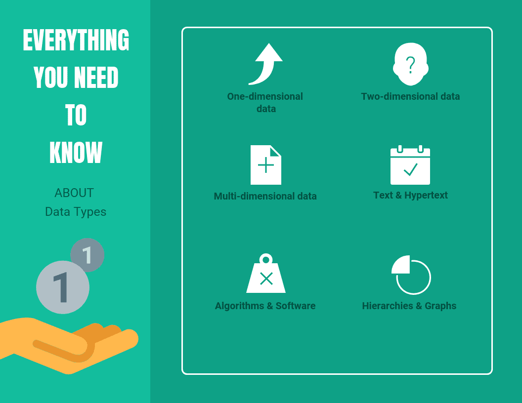
What are the Data Types to be Visualized?
- One-dimensional data: One-dimensional data has one compact dimension, and a good example is temporal data. At any point in time, one or several data values may be associated. Examples are time series of news data and stock prices.
- Two-dimensional data: It has two distinct dimensions a good example is a geographical data. Geographical data has two dimensions; one is latitude and the other one longitude. X-Y- axis which is seen in maps are methods of showing two-dimensional geographical data. Caution is advised when dealing with geographic or temporal data. At times the temporal axes may get glutted quickly, making it hard to understand data, this is caused by a large number of records being visualized.
- Multi-dimensional data: Multi-dimensional data has more than three dimensions affecting simple visualization compared to 2-3 dimensional plots. An excellent example of multidimensional data is relational databases tables, which have several attributes. Sophisticated visualization technique is needed on this data type because there is no mapping of the characteristics to two dimensions of the screen. The parallel coordinate technique allows the visualization of this data type.
- Text & Hypertext: Not all data types are in the form of dimensional others are in the form of text and hypertext. With these data types, normal visualization techniques can’t be applied because numbers can't describe them. Before visualization technique is used the data is transformed into description vectors.
- Algorithms & Software: A massive software project is usually a challenge. Supporting software development by simplification of algorithms is a goal of visualization. Example by broadening the understanding of written code, represent the structure as a graph of multiple source codes, show flow of information in the software and support debugging of code by a programmer, i.e., visualizing bugs.
- Hierarchies & Graphs: Other information components have a relationship with data records. Graphs represent interdependencies and consist of nodes and connections between edges. A good example of graphs includes email interrelationships among individuals, hyperlinks in the www, file structure of hard disk or people shopping behaviors. There are a couple of specific visualization techniques that deal with graphical and hierarchical data.
You may like to read: Top Challenges every organization face in Business Intelligence
What are the Data Types to be Visualized
What are the Common Interactions in Visualization?
- Painting: Painting is commonly referred to a persistent operation or persistent brushing. Persistent brushing is essential when grouping points into clusters then use another process, a good example tour, to compare the group.
- Identification: Identification is also known as label brushing or labeling; other plot manipulation can be linked. Taking cursor near a bar in a bar chart, a point in a scatterplot for a label to appear which identifies the plot element. It is commonly available in several interactive graphs and known as mouse over.
- Scaling: Changing of mapping function when data is mapped onto the window helps in understanding different things from similar plots. With scaling, you can zoom in on a scatterplot congested regions and change the aspect ratio of a plot to reveal various features of the data.
- Brushing: It is when you control a paintbrush then it directly changes the color of elements in a plot by moving the mouse. The paintbrush works by creating outline drawings around points and also acts as a pointer at times. The outline is sometimes like a lasso (shaped irregularly).
Brushing is regularly used when linking mechanisms exist between plots or several plots are visible. Brushing scatterplots can be transient and persistent operation. Transient operation points in the actual plot keep their new appearance while intersected or enclosed by the brush. While with a persistent operation, points keep their new characteristics once the brush moves away. It’s commonly chosen for linked brushing.
You may like to read: Top Best Practices for Business Intelligence Software Implementation
- Linking: Linking connects selected element from one plot to another. One to one is the most straightforward kind of linking where projections are different from each point of same data, and points on one plot correspond to the other. When you use area plots, brushing it all and brushing one area has the same effect and its equivalent to selecting all cases in the category.
Some plot aspects may represent several cases, and the fundamental link is still one plot to one case, the same case to other plots. Linking can be categorical variable as well such as subject id wherein all visible plots data values are highlighted if they were corresponding to the subject.
You may like to review: Top Data Visualization Software, Free, Open Source and Top Data Visualization Software and How to Select the Best Data Visualization Software for Your Business
What are the Top Best Practices in Data Visualization
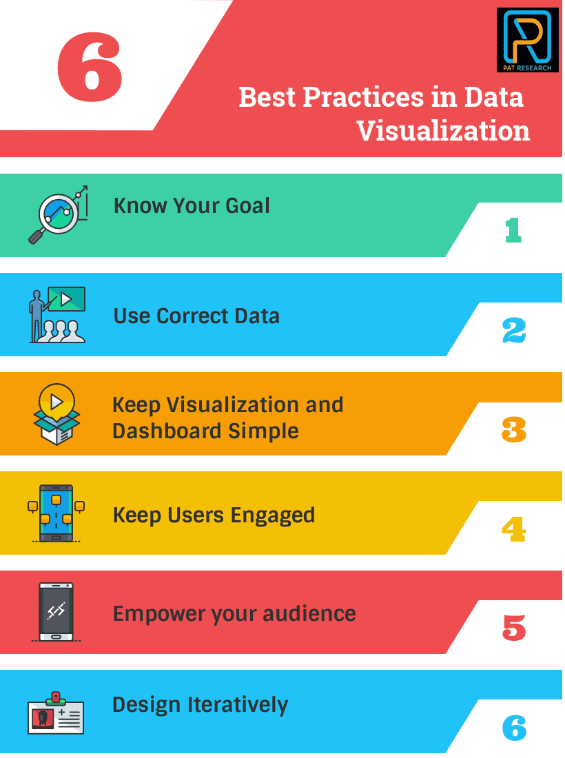
Top Best Practices in Data Visualization
Data Visualization Best Practices 1 - Know Your Goal
Information and message are not the same things. A message is the selected set of information to be communicated while information is the set of messages selected by the information source. Why is this important? Choosing your message is paramount in this world where information is increasing rapidly. But before you decided your message it’s crucial to know:
- What are your goals?
- Who is your intended audience?
- What is your expected message/information?
- What’s your desired effect?
The answers to the questions will be different ranging with different fields. BI Analyst in a company would have different goals to a data journalist or C.E.O, and sales manager may have different ways of understanding profitability.
Not all users will perceive the same information in the same way. If you are unable to make correct decisions on each of the above questions, it's appropriate not to continue with the implementation.
Data Visualization Best Practices 2 - Use Correct Data
In data visualization, there are three types of data: quantitative, ordinal and categorical. Different types of data work better with various visual features. For example line charts are a poor choice for non-ordinal as it implies continuity but work best with ordinal data whereas scatter plots works perfectly with two-dimensional of quantitative data. You should ensure you understand which data your visual is using. Here are examples:
- Quantitative Data- It is used to define how much is there in a particular thing
- Ordinal Data- Data that has a logical sequence and logically accorded together
- Categorical Data - Data which belong together
You may like to read: Open Source, Free and Top Dashboard Software
Data Visualization Best Practices 3 - Keep Visualization and Dashboard Simple
Users for long have identified to simplicity on content, and this applies to dashboards too. If everyone is designing their own data visualization in your organization, you’ll require designs that have maximum impact.
Excellent data is one that offers tips on improving data visualization and has an outstanding in-house data visualization competency center. If proper models are used, your enhanced visualization will assist your audience to:
- Understand high-level information overview
- Assist themselves with more information
- Use data visualization to respond to questions effectively.
Data Visualization Best Practices 4 - Keep Users Engaged
Just like how calendars assist in guiding you on your daily activities. Here are some two ways to engage routinely and encourage your employees to data discovery:
- Regular scheduling email reports and
- Metric-driven notifications
With both practices, there is continual engagement and calls to action. With regular email reporting, this facilitates data visualization to users so that they may explore their dashboards in detail. Notifications are usually triggered by different users when the dashboard drops below the set threshold where users are urged to examine their KPIs and take action.
Data Visualization Best Practices 5 - Empower your audience
The primary objective of implementing data visualization in your business is to empower your audience. Ensure that everyone understands why your company invested in the first place in analytics. Information should cultivate action.
Development of creative dashboards and visualization shouldn’t be for the essence of distributing information to your audience. You should be able to do more than just monitoring customer patterns, measuring processes effectiveness and tracking business performance.
- When implementing visualization ensure you identify the highest priority individual. Avoid creating a dashboard that meets all stakeholders’ need, who might never use it or look at it once
- Design a wireframe that will drive action for your business by answering the questions. Which KPIs answer important business strategic questions? E.g., Create a market share threshold which if the share falls below the threshold the wireframe creates a visualization approach that identifies a concerning trend fast and efficiently. When using this approach, it ensures your visualization contains meaningful and actionable data.
- Ensure that your visualization aligns individuals with your mission and empowers them.
Data Visualization Best Practices 6 - Design Iteratively
You shouldn’t wait until your objectives are entirely understood. Visualization requires there interpretation of the visual concept on how your end-users conceived your ability to discern their visual requirements. The design is a difficult thing to accomplish 100% between you and your end users.
The best way is to get all the requirements and design a prototype or prove of concept, give out the feedback in an interactive form and revise with your end-user on the visuals. By doing this, it will enable you to avoid “analysis paralysis” which consistently happen when you use old project and visualization management approaches.
In conclusion, data visualization plays a crucial role in helping organizations make sense of complex data sets and gain insights that can inform decision making. By visually representing data in an intuitive and easy-to-understand format, data visualization enables businesses to identify patterns, trends, and relationships that might not be apparent through traditional data analysis methods. With the increasing volume of data generated by organizations, data visualization has become a key tool in the arsenal of businesses looking to derive value from their data. From dashboard design to interactive visualizations and reporting, data visualization has the potential to transform the way organizations approach data analysis and decision making. By adopting best practices in data visualization, organizations can unlock the full potential of their data and achieve their goals.
Here are the trending and the top rated Top Free Bigdata Visualization Tools for you to consider in your selection process:


Here are the trending and the top rated Top Data Visualization Software for you to consider in your selection process:


You may like to review: Top Data Visualization Software, Free, Open Source and Top Data Visualization Software and How to Select the Best Data Visualization Software for Your Business
What is Data Visualization?
Data visualization is the process where raw data (quantitative or qualitative) results in an image which users can read and support examination, communication, and exploration of the data. The data collected from various forms of evaluation process can be visualized potentially.
What are the data types to be visualized?
The data types to be visualized are one-dimensional data, two-dimensional data, multi-dimensional data, text & hypertext, algorithms & software, hierarchies & graphs.
What are the Common Interactions in Visualization?
The common interactions in visualization are painting, identification, scaling, brushing and linking.
What are the Top Best Practices in Data Visualization?
The top best practices to follow in Data Visualization success includes know your goal, use correct data, keep visualization and dashboard simple, keep users engaged, empower your audience and design iteratively.


By clicking Sign In with Social Media, you agree to let PAT RESEARCH store, use and/or disclose your Social Media profile and email address in accordance with the PAT RESEARCH Privacy Policy and agree to the Terms of Use.